Posted on

Why Sticker Marketing ROI Is So High for Businesses

Why Sticker Marketing ROI Is So High for Businesses

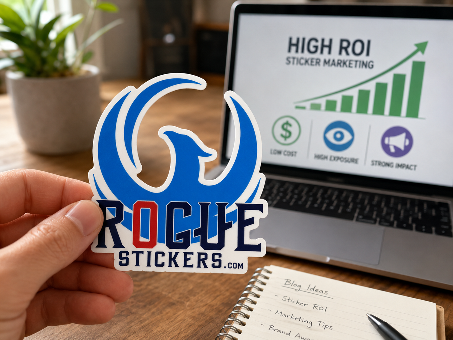
Most marketing disappears the moment you stop paying for it. A social media ad stops running. A flyer gets thrown away. An email gets deleted. A custom sticker can keep working for months or even years after the original cost has already been paid.

That staying power is one of the biggest reasons sticker marketing delivers such a strong return on investment. Stickers are affordable to produce, easy to distribute, and capable of turning customers into people who willingly display your brand.

At Rogue Stickers, we have seen businesses use stickers on packaging, at events, inside online orders, as product labels, and as simple giveaways. The best results happen when the sticker is not treated as an afterthought. It should be designed as something people actually want to keep.

Stickers Create Repeated Brand Exposure

A business card usually ends up in a wallet, drawer, or trash can. A good sticker gets placed on a laptop, water bottle, cooler, toolbox, vehicle, notebook, or phone case. Every time that item is used in public, the sticker creates another impression.

The business only paid for the sticker once, but the brand can be seen hundreds of times. That makes the cost of each impression smaller every time the sticker is noticed.

This is especially valuable for local businesses. A sticker placed on a vehicle, reusable cup, or laptop can travel through neighborhoods, coffee shops, gyms, offices, schools, and events. It puts the brand in front of people who may never have seen a traditional advertisement.

Customers Choose to Promote the Brand

People ignore most advertising because it interrupts them. Stickers work differently. When someone chooses to display a sticker, the promotion feels personal rather than forced.

That customer is telling other people that the brand, artwork, message, or lifestyle means something to them. This creates a level of trust that paid advertising often struggles to match. The sticker becomes a recommendation without anyone having to say a word.

This is why the design matters so much. A plain logo may identify the company, but a clever phrase, strong illustration, local reference, or memorable mascot gives people a reason to display it. Our guide to effective sticker design explains how to create a design that earns a place on someone’s belongings.

The Cost Is Low Compared With the Potential Reach

Custom stickers can fit into marketing budgets of almost any size. Small businesses can add them to orders without significantly increasing packaging costs. Restaurants can hand them out with checks or takeout orders. Bands and artists can sell them as affordable merchandise. Event organizers can include them in giveaway bags.

A sticker can also serve more than one purpose. It can seal tissue paper, brand a shipping box, reward a customer, promote a social account, or become a product that generates revenue.

That flexibility allows businesses to get more value from one print order. Instead of paying separately for packaging decoration, promotional materials, giveaways, and merchandise, the same sticker design can support several parts of the customer experience.

How Stickers Can Support Packaging and Customer Communication

The return on a sticker is not limited to public visibility. Stickers can also improve the way a customer feels when an order arrives.

A well placed sticker makes plain packaging feel more intentional. A free sticker inside the package adds a small surprise without adding much cost. That extra detail can make the order more memorable and give the customer another reason to share it online or purchase again.

Custom clear vinyl stickers work well for bottles, jars, windows, and premium packaging. Custom sticker sheets allow a brand to include several designs, messages, or characters in one package.

Quality Extends the Return

A sticker only produces long term value when it holds up. Thin paper stickers may fade, tear, or peel before they have a chance to create meaningful exposure.

Durable vinyl, strong color, clean cutting, and the right adhesive help a sticker continue representing the brand after repeated use. When the sticker looks professional, the business looks professional.

Rogue Stickers prints custom stickers in Austin, Texas, and provides an online proof before production. That proof gives customers a chance to review the artwork, shape, border, and final layout before the order is printed.

How to Measure Sticker Marketing ROI

Sticker marketing can be measured in several practical ways. A business can print a QR code that leads to a specific landing page, use a unique discount code, ask customers where they saw the brand, or track social posts where the sticker appears.

Businesses can also compare repeat purchase rates when stickers are included in packaging. At events, they can track website traffic, social follows, or coupon use after stickers are distributed.

Not every benefit will appear immediately on a sales report. Brand recognition builds over time. The real value comes from combining measurable responses with the repeated exposure created every time a customer displays the sticker.

A Small Product With a Long Marketing Life

Sticker campaigns can deliver value when the design, distribution and audience fit the goal. Measure results instead of assuming a particular return. A good sticker travels, gets shared, improves packaging, builds recognition, and gives customers a simple way to connect with a brand.

The most successful sticker is not merely an advertisement. It is something people want.

Ready to turn your artwork or logo into a marketing tool that keeps working? Explore the complete selection of custom stickers from Rogue Stickers, or start with custom die cut vinyl stickers made to follow the exact shape of your design.

Compare custom logo stickers and multi-design sticker sheets. For questions about a specific application, contact Rogue Stickers before ordering.

Posted on

Custom Stickers for Austin Events and Texas Trade Shows

The Ultimate Guide to Custom Merch & Stickers for SXSW, ACL, and Texas Trade Shows

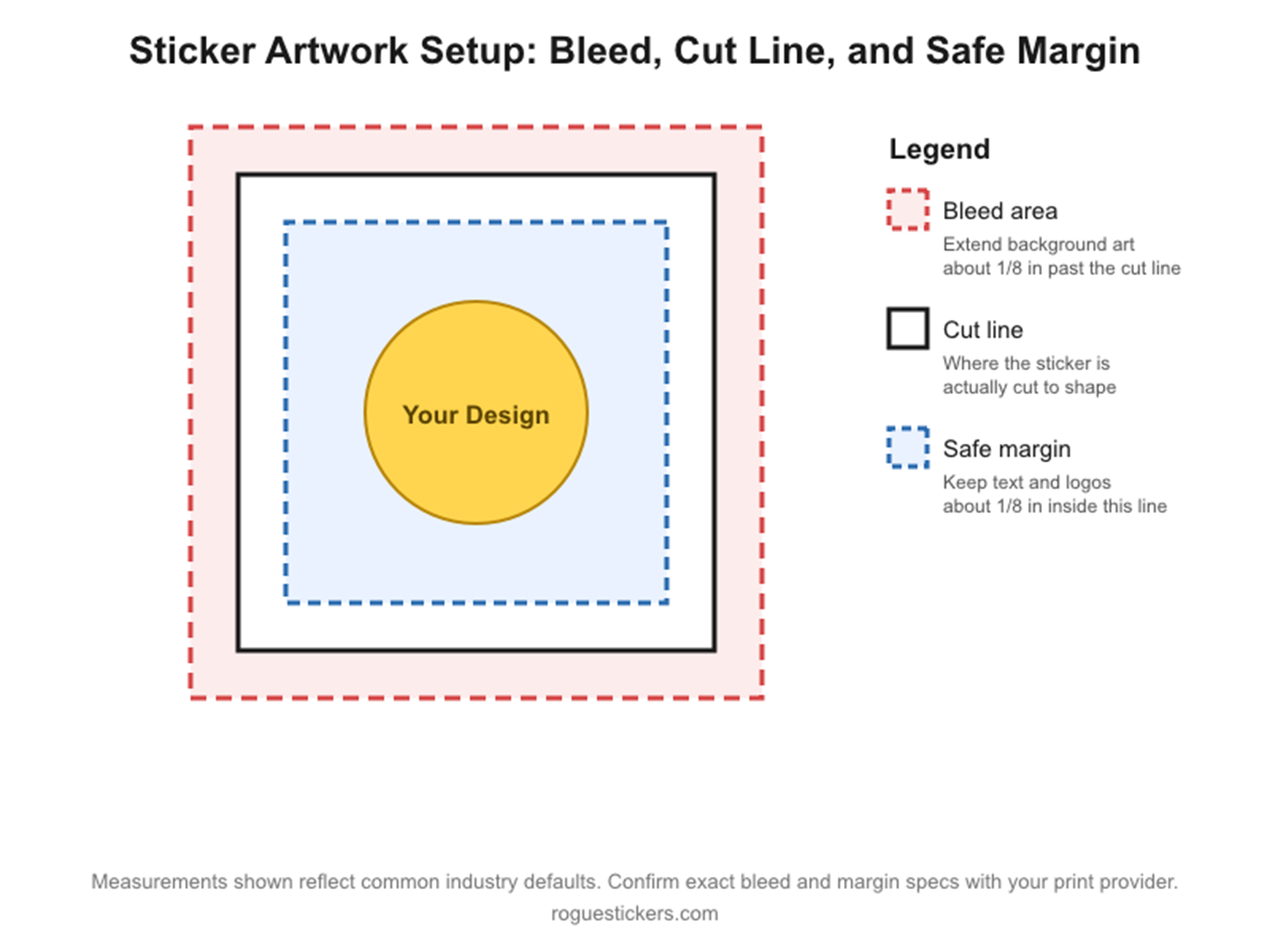
Custom stickers can be practical handouts, packaging inserts and merchandise for Austin festivals and Texas trade shows. Plan around your audience, artwork, distribution rules and deadline rather than assuming every event needs the same sticker.

Confirm the event and production schedule

Use the organizer’s current dates, rules and exhibitor information when planning. Allow time for artwork, proof changes, approval, production and delivery. Contact us before ordering if you have a firm deadline. Rush production, expedited delivery or local collection should only be relied on after our team confirms availability for your order.

Choose a useful format

Die cut stickers suit custom logo outlines. Kiss cut stickers leave backing intact for easier handling. Holographic material adds a reflective effect, while a sticker sheet can hold several designs. Choose based on the artwork and how people will receive and use it.

Set a sensible quantity

The minimum is 50 stickers per item unless the product page lists a higher minimum. Estimate how many attendees you can realistically reach and decide whether the design will be given away, sold or included with a purchase. Check the price at your actual quantity.

Make the artwork readable

Check small text at the printed size. Keep QR codes clear of busy graphics and test the exact file, destination and physical size before printing. A short instruction such as “Scan for the menu” is more useful than an unexplained code. See our QR code sticker guide.

Respect event and venue rules

Give stickers to people who want them. Do not encourage placement on venue property or other people’s belongings without permission. Event names do not imply that Rogue Stickers is an official sponsor, vendor or partner.

Measure what the campaign does

Define a goal before printing. A dedicated landing page or campaign code can help track response, although not every sticker impression is measurable. Avoid assuming a giveaway will deliver a specific return. Compare sticker styles or ask us about your event plan.

Compare custom logo stickers and multi-design sticker sheets. For questions about a specific application, contact Rogue Stickers before ordering.
Posted on

How to Prepare Artwork for Custom Sticker Printing

How to Prepare Artwork for Custom Sticker Printing

How to Prepare Artwork for Custom Sticker Printing: The Ultimate File Setup Guide (CMYK, Bleeds, and Cut Lines)

If you have ever opened a proof from a print shop and thought “that is not what I designed,” you already know why file setup matters so much. Stickers are unforgiving. A tiny mistake in color mode, resolution, or bleed can turn a crisp logo into a blurry mess or a clean die cut into something with a stray white edge.

The good news is that once you understand a handful of print rules, you can set up artwork correctly every single time. This guide walks through everything our team at Rogue Stickers looks for when we review a customer file, so you can catch problems before you ever hit submit.

Vector Versus Raster: Know What You Are Working With

Every image file falls into one of two categories.

Vector files are built from mathematical paths rather than pixels. Programs like Adobe Illustrator, Affinity Designer, and Inkscape create vector files (usually saved as .ai, .eps, or .svg). Because vectors are math, not pixels, they can be scaled up or down to any size with zero loss in quality. This is why print shops love vector logos and text. If your design is mostly typography, icons, or flat illustration, vector is almost always the better format.

Raster files are made of pixels, like photographs. Formats such as .jpg, .png, and .psd are raster. Raster art can look great, but only if it starts at a high enough resolution. If you enlarge a small raster image, you are stretching a fixed number of pixels, and the result gets soft or blocky.

A common mistake we see is a customer pulling a logo off their own website. Web graphics are almost always low resolution raster files sized for screens, not print, and they fall apart the moment they are enlarged for a three inch sticker. If you only have a web logo, ask the original designer for the vector source file before you order.

Resolution: Why 300 DPI Is the Standard

If your artwork is raster based, resolution is everything. The print industry standard is 300 DPI (dots per inch) at the final, actual output size of your sticker.

This part trips people up constantly: DPI only means something in relation to physical size. A file that is 300 DPI at 2 inches by 2 inches is not the same file once you stretch it to 6 inches by 6 inches. If you resize the canvas without adding real pixel information, the effective resolution drops and the print will look blurry or pixelated.

A quick way to check this in Photoshop is to go to Image, then Image Size, and look at the resolution field alongside the document dimensions. If you are designing a 4 inch sticker, make sure the document is set to 4 inches at 300 DPI from the very start, not scaled up afterward.

Color Mode: RGB Versus CMYK

Screens and printers speak two different color languages, and this is one of the biggest sources of “why does my printed sticker look different than my screen” complaints.

Your monitor displays color using RGB, which stands for red, green, and blue light. RGB can produce extremely bright, glowing colors, especially neons and vivid blues, because it is generating color with light itself.

Commercial printers, including the equipment used for custom stickers, build color using CMYK, which stands for cyan, magenta, yellow, and black ink. CMYK has a smaller range of achievable colors than RGB, particularly in the neon and deep blue range. When an RGB file gets converted to CMYK for print, colors can shift and appear slightly duller or different than what you saw on screen.

The fix is simple: convert your file to CMYK yourself before you export it, rather than letting the printer’s software make that decision at the last minute. In Illustrator or Photoshop, this is done under File, then Document Color Mode, or File, then Convert to Profile. Reviewing your design in CMYK ahead of time means no surprises when the proof arrives.

Bleed, Cut Lines, and Safe Margins

This is the part that separates a professional file from an amateur one, and it is where die cut stickers most often go wrong.

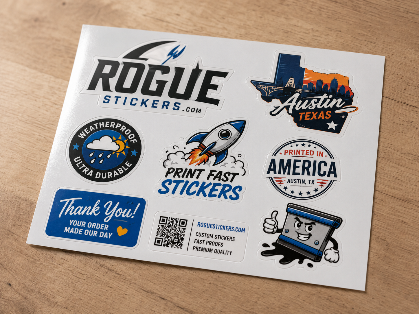
Bleed is extra artwork that extends past the edge of where your sticker will actually be cut. Because cutting machines have a small margin of physical movement, if your background color or image stops exactly at the cut line, even a slight shift can leave a thin white sliver along the edge. Extending your background by roughly one eighth of an inch beyond the cut line, a standard bleed allowance used across the printing industry, gives the machine room to cut without exposing white paper. As always with a specific vendor’s requirements, it is worth confirming the exact bleed measurement Rogue Stickers requests for your particular sticker shape on our artwork guidelines page.

The cut line marks exactly where your sticker’s final shape will be cut. For custom die cut stickers that follow the outline of your design, this line traces the contour of your artwork.

The safe margin is an inner boundary, typically kept about one eighth of an inch inside the cut line, where you should keep all important text, logos, and details. Anything placed right at the cut line risks being trimmed off if the cut shifts even slightly.

Picture three nested outlines: the outer one is your bleed, the middle one is the actual cut line, and the inner one is your safe zone for text and important graphics. Keeping this structure in mind while you design will save you from misaligned or clipped prints.

Common Mistakes That Lead to Blurry Prints or Bad Cuts

  • Pulling a logo from a website instead of requesting the original vector file
  • Designing at a small size and scaling up later instead of building at final print size from the start
  • Leaving text or logos too close to the edge with no safe margin
  • Forgetting bleed entirely, which is the number one cause of white edges on die cut stickers
  • Exporting in RGB and being surprised when printed colors look different than the screen
  • Flattening a file with a transparent background into a white background by accident, especially common when exporting PNGs from certain design tools

Templates to Get You Started

Working from a template built to the correct dimensions is the easiest way to avoid all of the mistakes above. We recommend starting with a template sized in Illustrator, Photoshop, or Canva that already includes bleed, cut line, and safe margin guides for your chosen sticker shape and size. If you are not sure which starting point fits your project, our team can point you to the right one, or you can browse current options directly at Rogue Stickers before you upload your file.

Before You Upload

Run through this short checklist:

  1. Is your file vector, or if raster, is it at least 300 DPI at final size?
  2. Is your document set up in CMYK?
  3. Does your background extend into the bleed area?
  4. Is important text or artwork kept inside the safe margin?
  5. Does your cut line match the shape you actually want?

Getting these five things right before you upload means fewer rounds of proofing, a faster turnaround, and a sticker that actually matches what you designed. If you run into anything unclear along the way, reach out to our team at Rogue Stickers and we are happy to look over your file before it goes to print.

A note on accuracy: bleed and margin figures above reflect standard practice across the sticker printing industry. I was not able to verify Rogue Stickers’ exact current bleed specifications, template downloads, or page URLs from the information available to me, so please confirm those specific numbers and links with your prepress or production team before publishing this post, and swap in the real template and guidelines URLs once confirmed.

Read our sticker artwork preparation guide and proofing FAQ. For questions about a specific application, contact Rogue Stickers before ordering.

Posted on

The Unboxing Anatomy: How E-commerce Brands Use Custom Sticker Sheets to Drive Customer Retention

The Unboxing Anatomy: How E-commerce Brands Use Custom Sticker Sheets to Drive Customer Retention

The Unboxing Anatomy: How E-commerce Brands Use Custom Sticker Sheets to Drive Customer Retention

If you run a direct to consumer brand, you already know the unboxing moment is not just packaging. It is marketing real estate that most brands waste on tissue paper and a thank you card. The founders who understand this are quietly turning a two dollar insert into a repeat customer machine, and the tool doing the heavy lifting is often something as simple as a custom sticker sheet.

This is not a post about how to order stickers. It is a post about how to use them to make money.

Why Sticker Sheets Belong in Your Packaging Strategy, Not Your Swag Closet

Most brands treat stickers as an afterthought, a single die-cut logo tossed in as a courtesy. A sticker sheet is a different product entirely. Instead of one sticker, you are handing the customer a curated collection, usually five to twelve designs on a single printed sheet, built around a theme, a product drop, or a brand world.

The shift from “single sticker” to “sheet” changes the psychology of the unboxing completely. A single sticker gets used or it does not. A sheet invites the customer to make choices: which one goes on the laptop, which one goes on the water bottle, which one gets saved. That decision-making moment is where retention marketing actually happens, because you have turned a passive customer into someone actively curating your brand.

The Psychology of Why People Stick and Collect

I am not a behavioral psychologist, and I want to be upfront that I have not seen a peer-reviewed study specifically measuring sticker sheet collection behavior, so I will not pretend one exists. What I can speak to is what I have observed first-hand, packing thousands of these sheets for e-commerce clients and watching how customers respond in reviews, unboxing videos, and social tags.

A few patterns show up consistently:

Completionism drives engagement. A sheet with multiple designs taps into the same instinct that makes people finish a sticker album or a trading card set. Customers want to use or place every sticker on the sheet, not just one.

High-visibility placement turns customers into unpaid media. Laptops, water bottles, car bumpers, and phone cases are surfaces other people see constantly. When a customer places your sticker there, they are not just keeping your brand around. They are broadcasting it to coworkers, classmates, and strangers in a coffee shop line, essentially becoming an unpaid member of your street team.

Tangibility builds a stronger memory anchor than digital touchpoints. A sticker sheet sits in a drawer or a laptop lid for months or years. A promotional email gets deleted in seconds. If you are trying to build brand recall between purchases, a physical object beats a digital impression, at least in terms of longevity, even if I cannot cite an exact retention percentage difference between the two.

If you want to dig into the research side of consumer collecting behavior more formally, I would recommend searching for academic work on “collecting behavior consumer psychology” through a source like Google Scholar rather than taking a single blog’s word for it, mine included.

Why This Is a Higher Margin Play Than You Think

Free packaging inserts sound like a cost center until you look at the math. A well-designed sticker sheet costs a fraction of what most brands spend on other retention tactics like discount codes, loyalty programs, or paid retargeting ads. You are not discounting your product or paying a platform fee. You are printing a physical asset once and letting it generate brand exposure passively for as long as the sticker survives.

For higher-ticket product lines especially, a sticker sheet insert reinforces the premium feel of the purchase rather than undercutting it. Slipping a coupon into a $200 order can feel like you are apologizing for the price. Slipping in a beautifully designed, on-brand sticker sheet feels like a gift, not a discount.

What Makes a Sticker Sheet Insert Actually Work

Not every sheet performs the same way. From what I have seen packing these for clients, the sheets that actually get used and displayed share a few traits:

  • They match the drop, not just the logo. A generic logo sticker gets ignored. A sheet designed around a specific collection, season, or product launch feels collectible and limited.
  • They include a mix of icon and text-based designs. Customers want variety. A sheet that is all wordmarks feels flat compared to one that mixes illustration, iconography, and typography.
  • The material holds up outdoors and on metal. If you want your sticker on a water bottle or a car bumper, it needs to survive weather, condensation, and dishwasher-adjacent abuse. A cheap laminate peels within weeks and undoes the entire strategy.
  • They are sized for real surfaces. Laptop lids, Hydro Flasks, and skateboard decks all have different usable space. Sheets designed with those surfaces in mind get used more than a single oversized sticker that does not fit anywhere.

If you are sourcing these for your own packaging, our team at RogueStickers builds custom sticker sheets specifically for e-commerce packaging inserts, with weatherproof vinyl options that are meant to survive the water bottle and laptop lifecycle, not just sit in a junk drawer. You can see the specs on our custom sticker sheets page if you want to compare stock, sizing, and finish options before your next print run.

A First-Hand Look at the Packaging Layer

Below is an example of the kind of packaging setup we help DTC brands build: a custom multi-design sticker sheet resting inside a branded shipping box, positioned so it is the first thing a customer sees when they open the package. The goal is always the same, make the sticker sheet feel like part of the product experience, not an afterthought thrown in at the last second before sealing the box.

(Insert real, unedited photos here of your own printed sticker sheets inside your packaging. Photos you have taken yourself of your own manufacturing work are one of the strongest trust signals you can put on this page, both for readers and for search engines evaluating first-hand expertise.)

How to Brief Your Sticker Sheet Like a Marketer, Not a Print Buyer

When you are ready to design your own insert, treat the brief the way you would treat an ad creative brief, not a print order.

  1. Define the placement goal first. Are you designing for laptops, water bottles, or car windows? The surface should inform the size and shape of each design on the sheet.
  2. Build in a “hero” design. Give the sheet one standout piece, usually the largest or most detailed, that customers are most likely to actually use. The rest of the sheet can be smaller, simpler supporting designs.
  3. Leave white space between designs. Overcrowded sheets are harder to cut apart cleanly, and customers are less likely to bother separating a cluttered sheet.
  4. Match the packaging, not just the product. The sheet should visually connect to your box, your mailer, or your tissue paper, so the entire unboxing feels designed as one experience rather than assembled from mismatched vendors.

The Bottom Line

A custom sticker sheet is one of the lowest cost, highest visibility retention tools available to an e-commerce brand, and it works because it turns a single purchase into ongoing, physical brand exposure. It will not replace a full retention strategy on its own, and I would not claim it outperforms email or loyalty programs across the board without brand-specific data to back that up. But as a packaging insert that customers actually want to keep, use, and show off, it is hard to beat the economics.

If you want to build a sticker sheet insert for your next product drop, our team at RogueStickers works directly with e-commerce and DTC brands on custom packaging inserts, from initial design through weatherproof printing. Reach out through our site to start a proof for your next order.


A quick honesty note for transparency: the psychology points in this article reflect first-hand observations from packing and shipping these products, not formal clinical research, and I have flagged that distinction throughout. If you are citing consumer behavior claims in your own marketing materials, I would recommend verifying any specific statistic against a primary source before publishing it as fact.

Compare custom logo stickers and multi-design sticker sheets. For questions about a specific application, contact Rogue Stickers before ordering.
Posted on

Why Your Custom Sticker Design Looks Blurry

Why Your Custom Sticker Design Looks Blurry

Why Your Custom Sticker Design Looks Blurry (How to Prep 300 DPI Artwork for Clear Printing)

You designed something you were proud of. It looked crisp and clean on your screen. Then the proof came back and the edges looked soft, the colors felt a little off, and that fine detail you loved just turned into a smudge. If that has happened to you, you are not alone, and more importantly, it is not your fault. It is almost always a resolution or color space problem, and both are completely fixable once you understand what is actually happening between your screen and the printed sticker in your hand.

Screens Glow. Ink Sits Still.

Your monitor builds color with light, using a mix of red, green, and blue known as RGB. Every pixel is glowing at you, which is why colors on a screen can look almost impossibly vibrant. Printers do not work that way at all. They lay down actual ink using cyan, magenta, yellow, and black, known as CMYK. Ink does not glow. It absorbs and reflects light, which is a completely different physical process than a backlit screen.

That difference is why a neon green or an electric blue that looks stunning on your laptop can look muted once it hits vinyl. It is not a printing error. It is physics. When you submit artwork through Rogue Stickers, we always recommend working in CMYK from the start rather than converting an RGB file at the last minute, because the conversion is where the most noticeable shifts happen.

What 300 DPI Actually Means for a 3 Inch Sticker

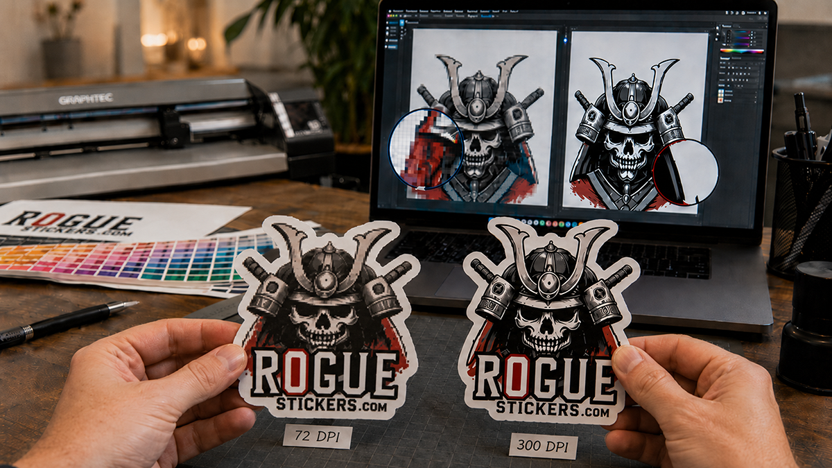
DPI stands for dots per inch, and it describes how much image information exists in a printed inch of space. On a screen, images are measured in pixels, and most web graphics are built for 72 pixels per inch because that is all a monitor needs to look sharp from a normal viewing distance.

Print is a different game entirely. At 300 DPI, a 3 inch sticker needs 900 dots of information packed into that width. If your file was built for the web at 72 DPI, that same 3 inch sticker only has about 216 dots to work with, and the printer has to stretch that thin amount of data across a much bigger physical space. That stretching is exactly what creates the blur, the pixelation, and the fuzzy text edges people complain about.

The good news is that vector files sidestep this problem completely. Formats like AI, EPS, or PDF built from vector artwork are made of math and paths rather than pixels, so they scale to any size without ever losing sharpness. If your logo or design was built in Illustrator or a similar vector program, you are already in great shape. If it started as a photo or a raster file, just make sure it was created large enough, or built at 300 DPI at the actual print size, before you upload it for your custom die cut stickers.

Bleed and Safe Zones, the Two Words That Save Your Design

Even a perfect file can print poorly if it is not set up with bleed and safe zones in mind. Bleed is the extra artwork you extend past your actual cut line, usually about an eighth of an inch, so that any tiny shift in the cutting blade does not leave a thin sliver of white at the edge. Safe zone is the opposite idea. It is the buffer you keep important text or logos away from the edge, so nothing critical gets trimmed off if the cut shifts slightly the other direction.

These two concepts are the single most common reason a first time customer gets nervous about ordering stickers, and it makes sense. Nobody wants to pay for a design only to receive it with a chopped off edge or a stripe of white where their background should be.

Why We Proof Before We Print

This is exactly where Rogue Stickers does things differently than a fully automated print shop. Every order we produce, whether it is a set of circle stickers, a run of clear vinyl stickers, or a batch of large die cut transfers, goes through a human review before it ever touches a print head.

Our team looks at your file for exactly the issues we just walked through. We check your resolution, we check your bleed, and we check your safe zone, and then we send you a digital proof so you can see precisely how your design will look before we commit it to vinyl. If something is off, we tell you, and we help you fix it. Nothing goes to production until you approve it.

That extra step exists because we would rather catch a problem on a screen than have you discover it after opening a box. A fully automated system can process your file in seconds, but it cannot look at your artwork and notice that your text is sitting a little too close to the trim line. A person can, and that is the difference between a sticker that looks fine and a sticker that looks flawless.

Getting It Right the First Time

If you are getting ready to order, keep three things in mind. Build or export your file in CMYK, work in vector format whenever possible or set your raster file to 300 DPI at true size, and always include bleed while respecting your safe zone. Then let our proofing process catch anything you might have missed.

Ready to see your design done right? Browse our full sticker catalog or head straight to our custom die cut sticker page to upload your artwork and get your proof today.

Read our sticker artwork preparation guide and proofing FAQ. For questions about a specific application, contact Rogue Stickers before ordering.