Posted on

How to Prepare Artwork for Custom Sticker Printing

How to Prepare Artwork for Custom Sticker Printing

How to Prepare Artwork for Custom Sticker Printing: The Ultimate File Setup Guide (CMYK, Bleeds, and Cut Lines)

If you have ever opened a proof from a print shop and thought “that is not what I designed,” you already know why file setup matters so much. Stickers are unforgiving. A tiny mistake in color mode, resolution, or bleed can turn a crisp logo into a blurry mess or a clean die cut into something with a stray white edge.

The good news is that once you understand a handful of print rules, you can set up artwork correctly every single time. This guide walks through everything our team at Rogue Stickers looks for when we review a customer file, so you can catch problems before you ever hit submit.

Vector Versus Raster: Know What You Are Working With

Every image file falls into one of two categories.

Vector files are built from mathematical paths rather than pixels. Programs like Adobe Illustrator, Affinity Designer, and Inkscape create vector files (usually saved as .ai, .eps, or .svg). Because vectors are math, not pixels, they can be scaled up or down to any size with zero loss in quality. This is why print shops love vector logos and text. If your design is mostly typography, icons, or flat illustration, vector is almost always the better format.

Raster files are made of pixels, like photographs. Formats such as .jpg, .png, and .psd are raster. Raster art can look great, but only if it starts at a high enough resolution. If you enlarge a small raster image, you are stretching a fixed number of pixels, and the result gets soft or blocky.

A common mistake we see is a customer pulling a logo off their own website. Web graphics are almost always low resolution raster files sized for screens, not print, and they fall apart the moment they are enlarged for a three inch sticker. If you only have a web logo, ask the original designer for the vector source file before you order.

Resolution: Why 300 DPI Is the Standard

If your artwork is raster based, resolution is everything. The print industry standard is 300 DPI (dots per inch) at the final, actual output size of your sticker.

This part trips people up constantly: DPI only means something in relation to physical size. A file that is 300 DPI at 2 inches by 2 inches is not the same file once you stretch it to 6 inches by 6 inches. If you resize the canvas without adding real pixel information, the effective resolution drops and the print will look blurry or pixelated.

A quick way to check this in Photoshop is to go to Image, then Image Size, and look at the resolution field alongside the document dimensions. If you are designing a 4 inch sticker, make sure the document is set to 4 inches at 300 DPI from the very start, not scaled up afterward.

Color Mode: RGB Versus CMYK

Screens and printers speak two different color languages, and this is one of the biggest sources of “why does my printed sticker look different than my screen” complaints.

Your monitor displays color using RGB, which stands for red, green, and blue light. RGB can produce extremely bright, glowing colors, especially neons and vivid blues, because it is generating color with light itself.

Commercial printers, including the equipment used for custom stickers, build color using CMYK, which stands for cyan, magenta, yellow, and black ink. CMYK has a smaller range of achievable colors than RGB, particularly in the neon and deep blue range. When an RGB file gets converted to CMYK for print, colors can shift and appear slightly duller or different than what you saw on screen.

The fix is simple: convert your file to CMYK yourself before you export it, rather than letting the printer’s software make that decision at the last minute. In Illustrator or Photoshop, this is done under File, then Document Color Mode, or File, then Convert to Profile. Reviewing your design in CMYK ahead of time means no surprises when the proof arrives.

Bleed, Cut Lines, and Safe Margins

This is the part that separates a professional file from an amateur one, and it is where die cut stickers most often go wrong.

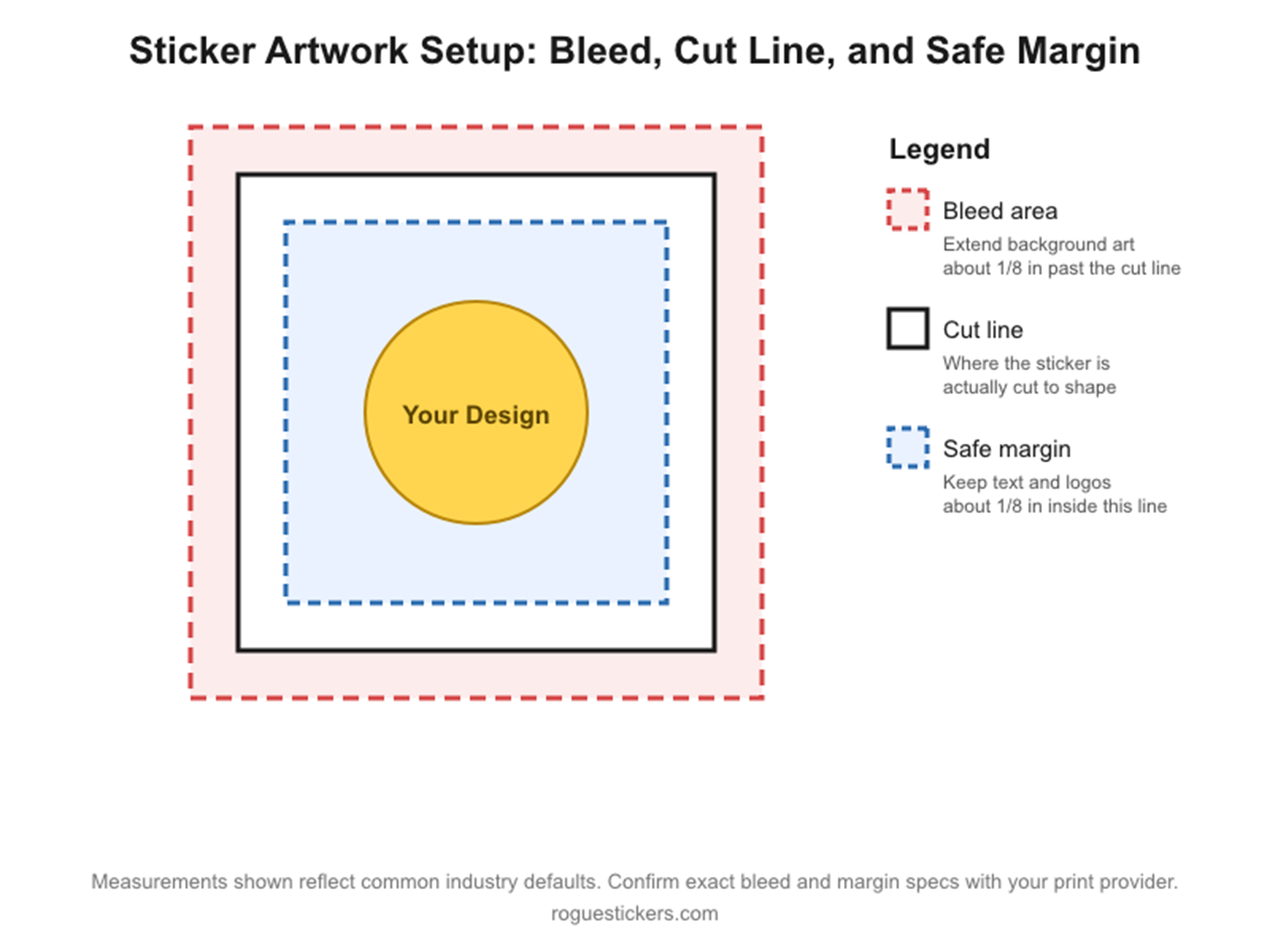
Bleed is extra artwork that extends past the edge of where your sticker will actually be cut. Because cutting machines have a small margin of physical movement, if your background color or image stops exactly at the cut line, even a slight shift can leave a thin white sliver along the edge. Extending your background by roughly one eighth of an inch beyond the cut line, a standard bleed allowance used across the printing industry, gives the machine room to cut without exposing white paper. As always with a specific vendor’s requirements, it is worth confirming the exact bleed measurement Rogue Stickers requests for your particular sticker shape on our artwork guidelines page.

The cut line marks exactly where your sticker’s final shape will be cut. For custom die cut stickers that follow the outline of your design, this line traces the contour of your artwork.

The safe margin is an inner boundary, typically kept about one eighth of an inch inside the cut line, where you should keep all important text, logos, and details. Anything placed right at the cut line risks being trimmed off if the cut shifts even slightly.

Picture three nested outlines: the outer one is your bleed, the middle one is the actual cut line, and the inner one is your safe zone for text and important graphics. Keeping this structure in mind while you design will save you from misaligned or clipped prints.

Common Mistakes That Lead to Blurry Prints or Bad Cuts

  • Pulling a logo from a website instead of requesting the original vector file
  • Designing at a small size and scaling up later instead of building at final print size from the start
  • Leaving text or logos too close to the edge with no safe margin
  • Forgetting bleed entirely, which is the number one cause of white edges on die cut stickers
  • Exporting in RGB and being surprised when printed colors look different than the screen
  • Flattening a file with a transparent background into a white background by accident, especially common when exporting PNGs from certain design tools

Templates to Get You Started

Working from a template built to the correct dimensions is the easiest way to avoid all of the mistakes above. We recommend starting with a template sized in Illustrator, Photoshop, or Canva that already includes bleed, cut line, and safe margin guides for your chosen sticker shape and size. If you are not sure which starting point fits your project, our team can point you to the right one, or you can browse current options directly at Rogue Stickers before you upload your file.

Before You Upload

Run through this short checklist:

  1. Is your file vector, or if raster, is it at least 300 DPI at final size?
  2. Is your document set up in CMYK?
  3. Does your background extend into the bleed area?
  4. Is important text or artwork kept inside the safe margin?
  5. Does your cut line match the shape you actually want?

Getting these five things right before you upload means fewer rounds of proofing, a faster turnaround, and a sticker that actually matches what you designed. If you run into anything unclear along the way, reach out to our team at Rogue Stickers and we are happy to look over your file before it goes to print.

A note on accuracy: bleed and margin figures above reflect standard practice across the sticker printing industry. I was not able to verify Rogue Stickers’ exact current bleed specifications, template downloads, or page URLs from the information available to me, so please confirm those specific numbers and links with your prepress or production team before publishing this post, and swap in the real template and guidelines URLs once confirmed.

Read our sticker artwork preparation guide and proofing FAQ. For questions about a specific application, contact Rogue Stickers before ordering.

Posted on

What Makes an Effective Sticker Design

What Makes an Effective Sticker Design? A Business Owner’s Complete Guide

By Rogue Stickers


Most business owners think about sticker design the wrong way.

They open their brand guidelines, drop their logo onto a square template, pick a background color, and send it to print. The result is a sticker that looks fine, but one that nobody actually wants to put on their laptop, their water bottle, or their car. It sits in a bowl on the counter, gets occasionally grabbed by a polite customer, and quietly disappears into a drawer.

Effective sticker design is not logo design. It’s not ad design. It’s not even packaging design. It’s a discipline with its own rules, its own success criteria, and its own psychology — and business owners who understand those rules consistently outperform competitors who treat sticker design as an afterthought.

This guide breaks down exactly what separates a sticker that people keep and display from one that ends up in the trash,  and how to apply those principles to your own brand.


Why Sticker Design Requires a Different Mindset

Before diving into principles, it’s worth reframing what you’re actually trying to accomplish with a sticker design.

A banner ad is trying to interrupt someone into clicking. A product label is trying to communicate information and drive a shelf decision. A sticker is trying to do something much harder: it’s trying to convince someone to voluntarily display your brand on their personal belongings as an expression of their identity.

That’s an extraordinary ask. People are deeply selective about what goes on their laptop lid or their Nalgene. Those surfaces are curated self-portraits. Every sticker on them was chosen because it communicates something the owner wants the world to know about them, their values, their humor, their tribe, their aesthetic.

Your sticker isn’t competing with other brand stickers. It’s competing with every other sticker a person finds appealing. It needs to earn its place purely on the strength of its design, personality, and cultural resonance. The brand association is secondary, if the design is good enough, the branding comes along for the ride.

This mindset shift, from brand communication to object someone wants to own,  is the foundation of every great sticker design decision.


The 7 Principles of Effective Sticker Design

1. Simplicity Always Wins

The most common mistake in sticker design is trying to include too much. Business owners want their logo, their tagline, their website, their phone number, their color palette, and their core brand message — all on a 2-inch circle.

The result is visual noise. From any distance greater than arm’s length, the design collapses into an unreadable smudge. On curved surfaces like water bottles, complex designs become even more distorted and illegible.

The best sticker designs are radically simple. They identify the one thing — one image, one phrase, one icon — that best represents the brand’s personality and build the entire design around it. Everything else is ruthlessly cut.

Ask yourself: if someone sees this sticker from across a coffee shop, what will they register? If the answer is “not much,” simplify until there’s only one clear visual idea left.

Great references for this principle: the Nike swoosh sticker, the Apple logo sticker (so simple it shipped inside every Mac for decades), or any of Patagonia’s mountain silhouette designs. One strong, instantly recognizable visual. Nothing more.

2. High Contrast Is Non-Negotiable

Stickers live in unpredictable environments — under fluorescent office lights, in bright outdoor sun, on dark laptop lids, on light-colored walls. A design that looks beautiful on your monitor at home may become nearly invisible in real-world conditions.

High contrast between foreground elements and background ensures your design remains legible across all these environments. This means:

  • Dark design on light background or light design on dark background — avoid middle-ground combinations where neither element pops.
  • Bold, thick letterforms rather than thin, delicate typography that disappears at small sizes.
  • Solid fills over gradients, especially for text and key graphic elements. Gradients can look stunning on screen and muddy on vinyl.
  • Enough breathing room around key elements so they read clearly without crowding.

Test your design by printing a small version in black and white. If it loses legibility, the contrast needs work.

3. Typography Must Work at Small Scale

If your sticker includes text — and many of the best ones do — typography is one of the most technically demanding aspects of the design.

Type that looks elegant and refined at large display sizes often becomes illegible at sticker scale. Fine serifs disappear. Tight letter spacing causes letters to bleed together. Decorative scripts become unreadable swirls.

Effective sticker typography follows these rules:

Choose bold, clear typefaces. Sans-serif fonts with consistent stroke width (like Futura, Gotham, or even a well-chosen geometric display font) tend to hold up at small sizes. If you’re using a branded serif, test it carefully at actual sticker dimensions.

Limit text to the essential. If you can’t read it at arm’s length in three seconds, cut it. This usually means a maximum of one short phrase, a brand name, or a single tagline — not multiple lines of copy.

Size up letter spacing slightly. Slightly more space between letters than feels natural at large sizes helps readability when the design is reduced.

Avoid text smaller than 8 points in the final printed size. Below that threshold, text on vinyl tends to fill in and blur, especially if the printing process involves any ink spread.

4. Choose a Shape That Enhances the Design

Most business owners default to a rectangle, square, or circle — and then design within those constraints. But die-cut stickers, which are cut to the precise shape of the design itself, are often far more effective because the shape becomes part of the visual impact.

A die-cut sticker of a mountain silhouette, a coffee cup, a lightning bolt, or a stylized animal feels more finished and intentional than the same design floating inside a rectangle. It looks like a designed object rather than a piece of paper with something printed on it.

Consider how the shape of your sticker communicates personality. Round shapes feel friendly and approachable. Sharp angles and irregular forms feel edgy and dynamic. Organic, irregular outlines feel natural and hand-crafted. The shape is doing design work before the viewer even processes the imagery or text.

If budget is a concern, start with die-cut. The premium over standard shapes is small at volume, and the difference in perceived quality is significant.

5. Color Strategy: Stand Out Without Chaos

Color is one of the most powerful tools in sticker design — and one of the most frequently misused.

Many business owners feel compelled to reproduce their full brand color palette on every sticker. The result is often a visually noisy design that competes with itself. Effective sticker color strategy is usually more restrained:

One or two dominant colors. The most memorable sticker designs rarely use more than two or three colors. Each additional color adds complexity and reduces visual impact.

Consider the surfaces where stickers live. Laptop lids tend to be silver, black, or white. Water bottles are often black, white, or metallic. Car bumpers are body-colored. A sticker that pops against most of these backgrounds will get displayed more than one that blends in.

Use white or transparent as your friend. A clean white background makes almost any color combination pop. Alternatively, a clear/transparent sticker with opaque elements allows the surface underneath to become part of the design — a sophisticated approach that feels premium.

Neon and high-saturation colors attract attention. For brands targeting younger demographics or visual subcultures like skateboarding, streetwear, or outdoor sports, saturated, almost-aggressive color choices signal cultural belonging.

Muted, earthy palettes signal quality and craft. For premium food and beverage brands, artisan producers, or lifestyle brands positioning on authenticity, restrained earthy palettes communicate taste and refinement.

Always proof physical color samples before your full print run. Colors render very differently on vinyl than they appear on screen.

6. Personality Over Perfection

Here is the design truth that most business owners find hardest to accept: a sticker with a strong personality and imperfect execution will outperform a technically flawless sticker with no character every single time.

People display stickers to express who they are. They’re not drawn to perfection — they’re drawn to personality. To voice. To something that feels human rather than corporate.

This is why the most beloved brand stickers often lean into humor, irreverence, specificity, or creative weirdness rather than polished professionalism. A craft brewery whose sticker says “Beer O’Clock Somewhere” will get more organic placements than one that produces a pristine rendering of their logo on a white oval. A local running shop whose sticker reads “0.0 — Just Kidding” connects with its community in a way that a corporate logo never can.

The question to ask is: does this sticker feel like it came from a human, or does it feel like it came from a committee? The former gets displayed. The latter gets discarded.

This doesn’t mean sloppiness is a virtue — execution quality still matters. But personality is the soul of effective sticker design, and it should guide every creative decision.

7. Design for the Long Game

Stickers are one of the few marketing assets that can outlast the campaign that created them. A sticker applied to a laptop in 2024 might still be generating impressions in 2028. That longevity is a major advantage — but it also means design decisions made today have a long tail.

Effective sticker design avoids elements that date quickly: trend-dependent visual styles (think of designs that scream “this was made during a specific era”), topical cultural references that lose meaning over time, or specific product names or offers that may change.

Instead, lean toward timeless visual concepts — strong graphic forms, wit that transcends the moment, imagery rooted in the brand’s enduring identity rather than its current campaign. The sticker should represent what your brand will still stand for five years from now.

This is also why limited-edition sticker series can be a smart strategy: they allow you to create timely, trend-responsive designs under a separate banner while keeping your core sticker range evergreen.


Common Sticker Design Mistakes to Avoid

Even experienced designers make these errors when working on stickers specifically. Watch for them in your own review process.

Too many elements competing for attention. Logos, taglines, websites, social handles, QR codes — each element added dilutes the impact of all the others. Pick one primary element and support it with at most one secondary element. Nothing more.

Designing at large scale and reducing without testing. A design that looks great at 10 inches may become illegible at 2 inches. Always proof your design at actual print size — printed on paper if necessary — before committing to a production run.

Ignoring bleed and safe zones. For die-cut stickers especially, elements placed too close to the edge risk being cut off in production. Work with your printer’s templates and respect their bleed guidelines.

Choosing fashionable over functional typography. The ultra-thin, delicate display fonts trending in brand design right now are often terrible choices for sticker applications. Prioritize legibility over on-trend aesthetics.

Neglecting material choice. A beautifully designed sticker on cheap paper stock signals a cheap brand. Weatherproof vinyl, quality lamination, and appropriate finish (matte vs. gloss vs. holographic) are as much a part of the design as the artwork itself. Match the material to your brand positioning.

Using raster images at low resolution. Sticker printing exposes every pixel of a low-resolution image. All artwork should be delivered as vector files (AI, EPS, or SVG) or as high-resolution raster files (minimum 300 DPI at print size). Never scale up a logo saved from a website — the results will be visibly poor.


Working With a Designer vs. Doing It Yourself

If you have design skills or access to quality tools, creating your own sticker artwork is absolutely viable — especially for simple typographic or icon-based designs. Platforms like Adobe Illustrator, Affinity Designer, or even Canva (for simpler applications) can produce solid results when you understand the principles above.

However, if your brand’s visual identity is core to your competitive differentiation — if the way your brand looks is a significant part of why customers choose you — working with an experienced graphic designer is worth the investment.

When briefing a designer, give them this single clear objective: design something people will genuinely want to put on their belongings. Not something that communicates your brand messaging. Not something that fits neatly into your brand guidelines. Something a person would choose to display as a piece of their identity. That brief produces very different — and far more effective — results.


From Design to Print: Final Checklist

Before sending your sticker design to production, work through this checklist:

  • Is the design legible at actual print size, viewed at arm’s length?
  • Is there strong contrast between foreground and background elements?
  • Have you proofed all text for spelling, spacing, and size?
  • Is all artwork provided in vector format or at minimum 300 DPI?
  • Have you accounted for bleed and safe zone requirements?
  • Does the die-cut shape (if applicable) enhance rather than distract from the design?
  • Have you ordered a physical proof before committing to the full print run?
  • Does the material and finish match your brand’s positioning?
  • Does the design have a personality distinct from a generic corporate logo treatment?
  • Will this design still feel relevant and on-brand in three to five years?

If you can answer yes to all ten, you’re ready to print.


The Bottom Line: Design That Earns Its Place

The business owners who get the most value from sticker marketing are not the ones who spend the most on printing — they’re the ones who invest in designs that people actually want. A single exceptional sticker design, printed well and distributed thoughtfully, will generate more brand equity than a dozen mediocre ones.

Great sticker design is simple, high-contrast, appropriately typeset, interestingly shaped, strategically colored, full of personality, and built to last. It asks not “does this represent our brand?” but “would someone choose to make this a part of their identity?” — and it doesn’t stop until the answer is genuinely yes.

Get that right, and your stickers will do the rest.


Thinking about creating your first custom sticker or refreshing an existing design? Start with one strong concept, brief a skilled designer with a human-centered objective, and always proof physically before printing at scale. A sticker done right is one of the most cost-effective brand investments you’ll ever make.

Read our sticker artwork preparation guide and proofing FAQ. For questions about a specific application, contact Rogue Stickers before ordering.

Posted on

The Power of Stickers in Marketing Campaigns

As the leaves start to fall and new campaigns begin to roll out, September is the perfect time to refresh your brand’s strategy—and custom stickers are a smart, flexible way to do it. Whether you’re launching a fall collection, preparing for Halloween, or simply tapping into back-to-school buzz, seasonal marketing stickers can help you stand out.

Why Use Stickers in Seasonal Marketing?

  1. Affordable & Effective Branding
    Stickers are a low-cost, high-impact way to brand packaging, personalize products, or elevate your customer experience.

  2. Customizable for Every Season
    You can design new custom die-cut stickers for fall, winter, or holidays without changing your core branding. Limited-edition = instant hype.

  3. Fast Turnaround for Quick Campaigns
    Need something fast for your Halloween drop or back-to-school push? We offer custom stickers with fast production and shipping.

  4. Great for Giveaways & Events
    Stickers make perfect freebies for in-store promotions, farmers’ markets, or product launches. Use weather-resistant stickers for outdoor events so your design holds up—even if the weather doesn’t.

  5. Boost Online & Offline Engagement
    Add QR code stickers to packaging or displays to drive traffic to your website or seasonal landing pages.


Design Ideas for Fall & Holiday Stickers

Need some inspiration? These are just a few ways our customers use seasonal marketing stickers:

  • Fall leaves, spooky icons, or warm color palettes for product labels

  • “Limited Edition” badges on high-quality stickers for product packaging

  • Personalized name tags or merch for pop-ups and craft fairs

  • Weather-resistant stickers with holiday messages for gift wrapping

  • Stickers with seasonal discount codes to drive urgency

With our easy ordering process and expert print quality, you’ll get the look you want—without the stress.

How to Order the Right Stickers

Not sure which type of sticker is best for your campaign? Rogue Stickers offers:

  • Custom Die-Cut Stickers for standout shapes

  • Kiss-Cut Stickers for easy peeling

  • Vinyl & Weather-Resistant Stickers for durability and outdoor use

  • Bulk Orders for large seasonal campaigns

  • Small Runs for limited drops or niche promotions


Get Ready for the Season with Rogue Stickers

No matter what your fall campaign looks like, Rogue Stickers is here to make it memorable. From sticker design to delivery, we’ve got you covered with high-quality stickers that help your brand stick.

👉 Ready to create your seasonal sticker line? Start your order now and make your brand impossible to ignore.