You spend time getting your sticker design right. The colors look good, the logo is sharp, and everything fits exactly where you want it. Then someone asks if your file has bleed.
If you have never prepared artwork for print, that question probably means nothing to you. Fair enough. Bleed is one of those details most people never think about until a sticker comes back with a thin white edge that was never supposed to be there.
Here is what it does and why it matters.
A Little Extra Artwork Makes a Big Difference
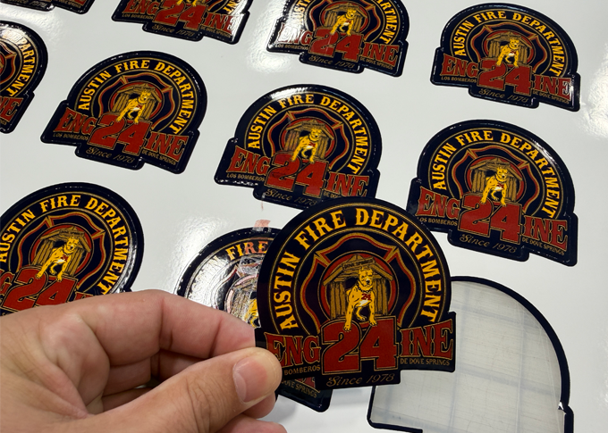
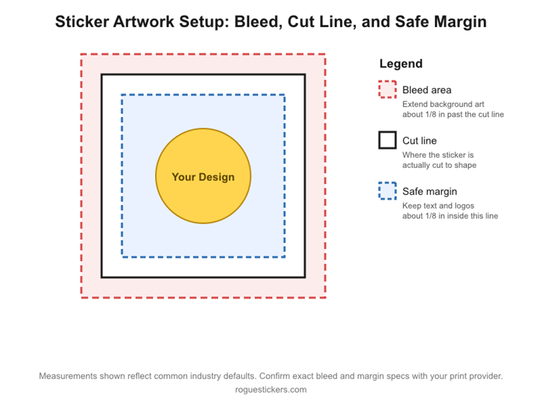
Bleed is the portion of your background color, photograph, or pattern that extends beyond the line where your sticker will be cut. That extra artwork gets trimmed away, allowing the printed design to reach the finished edge.
Printing and cutting involve physical materials moving through equipment. Small variations can happen. If your background stops exactly at the cut line, even a slight shift can expose an unprinted sliver. Bleed gives the cutter room to move while keeping color at the edge.
Picture a black sticker with a white logo in the middle. You want the entire sticker black, right up to the outside edge. Your file needs that black background to continue a little past the intended shape. Otherwise, an unexpected white line can stand out against the dark design.
It is a small detail, but once you see it, you cannot unsee it.
Bleed, Cut Lines, and Safe Space Have Different Jobs
The cut line defines your sticker’s finished shape. Bleed sits outside that line. Your important content belongs comfortably inside it.
That means lettering, logos, and other details you need people to see should have some breathing room. Extending the background outward protects the edge. Moving important details inward helps protect them from getting clipped. Our sticker artwork preparation guide explains how these parts work together.
For custom die cut stickers, think about the whole outline. If the background reaches the edge around a curve or corner, it needs to continue beyond that section too.
Adding Blank Space Does Not Add Bleed
Making your canvas bigger is only part of the job. The artwork itself has to extend into that extra space.
If you enlarge the canvas around a blue design but leave the added area white, you have not created blue bleed. You have added white space. The same applies to an empty transparent area around a design.
Extend the actual background. With a solid color, that can be straightforward. With a photograph or detailed pattern, it takes more attention because the added area needs to look like a natural continuation. Simply stretching the whole design can distort your artwork or push important details too close to the cut.
How Much Bleed Should You Add?
Use the measurement requested for your specific print job. Different printers and sticker formats can require different amounts.
For example, if the requested bleed is 1/8 inch on every side, a sticker measuring 3 inches by 3 inches needs artwork extending to 3.25 inches by 3.25 inches. The finished sticker still measures 3 inches square. The extra gets cut away.
If you are unsure what your Rogue Stickers order needs, contact us before finishing your file. It is easier to get the setup right while the artwork is still being built.
Give Your Proof More Than a Quick Glance
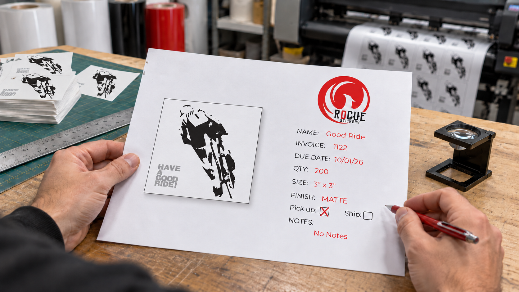
Rogue Stickers provides a digital proof before production. Take a moment to check the finished shape, intended border, and spacing around your lettering before approving it.
A white border can look great when it is part of the design. An unexpected white sliver is a different story.
You put work into your artwork. Give it the extra room it needs to look just as good once it is printed and cut.
A custom sticker proof is a visual representation of how your artwork is expected to appear as a finished sticker.
Depending on the product and printer, the proof may show:
• Your submitted artwork
• The finished sticker dimensions
• The proposed cut line
• A border around the design
• The placement of artwork within the cut shape
• Areas that may be trimmed
• Notes about image quality or production concerns
The proof gives you an opportunity to identify visible problems before the order enters production. It should be reviewed carefully, even when the artwork looked correct in the original design file.
A proof is not merely a formality. Approval usually confirms that the design, spelling, size, shape, and layout shown are acceptable for production.
Why Can the Proof Look Different From the Original Artwork?
The file you submit may need adjustments before it can be produced as a sticker.
A cut line may need to be created around the artwork. A border may be added to connect separate parts of the design. The artwork may need to be positioned inside a specific shape or resized to fit the selected dimensions.
Transparent space can also affect how a design is interpreted. An image may appear centered within its full canvas while the visible artwork sits noticeably to one side.
The proof shows how these production decisions affect the finished piece. That is why you should review the proof itself instead of assuming that the uploaded file will be reproduced exactly as it appeared on your screen.
What Should You Check First on a Sticker Proof?
Begin with the basic order information before inspecting small visual details.
Confirm:
• The correct design is shown
• The quantity matches your order
• The finished dimensions are correct
• The selected sticker shape is correct
• The orientation is correct
• The requested material or finish is correct
• The order contains the correct number of designs
Do not approve a proof simply because the artwork looks familiar. A correct design printed at the wrong size is still an incorrect order.
If you ordered several designs, review each proof separately. Similar filenames and alternate logo versions can be easy to confuse.
How Do You Confirm the Sticker Size?
Read the dimensions displayed on the proof and compare them with the size you intended to order.
Do not judge physical size only by how large the proof appears on a phone or computer screen. Screens enlarge and reduce documents according to the device, browser, and zoom setting.
A three inch sticker does not necessarily appear three inches wide on your screen.
Use a ruler to visualize the stated dimensions. You can also draw the dimensions on paper, print a paper reference at actual size, or compare them with an object that will receive the sticker.
Pay particular attention when your design is unusually wide or tall. The ordered size may refer to the longest dimension rather than both dimensions. A wide sticker ordered at three inches may be three inches wide but much shorter in height.
If the proof does not clearly explain how the dimensions are measured, ask before approving it.
What Is the Cut Line on a Sticker Proof?
The cut line shows where the sticker is expected to be cut from the surrounding material.
On a custom shaped sticker, this line normally follows the general contour of the artwork. It may not follow every tiny detail. Narrow gaps, sharp points, isolated elements, and intricate edges may need to be simplified or connected into a practical outer shape.
Review the entire cut line and ask:
• Does the shape match the design?
• Is the spacing around the artwork consistent?
• Are any important details too close to the edge?
• Are separate elements connected as intended?
• Are narrow points likely to look awkward?
• Does the cut line create an unexpected background area?
The visible line used to indicate the cut path on a digital proof is generally a production guide. It is not necessarily intended to print on the finished sticker. If that is unclear, confirm it with the printer.
Why Did the Printer Add a Border Around the Design?
A border can create separation between the artwork and the cut edge. It can also connect letters, icons, and other isolated elements into one complete sticker.
White is common because it provides contrast around many designs, but other border treatments may be possible depending on the product and artwork.
Inspect the border for consistency. Look closely around:
• Text
• Hair and fur
• Small illustrated details
• Narrow spaces between objects
• Sharp corners
• Transparent areas
• Dark artwork on dark backgrounds
A border that looks balanced around a simple logo may become much wider in small interior spaces. This can happen when the cut path is simplified to create a practical shape.
If you want no visible border, make sure that instruction is compatible with the artwork and clearly reflected in the proof. Some designs require additional artwork beyond the cut line to avoid an unintended exposed edge.
Should You Check Spelling Even If the Original File Was Correct?
Yes. Read every word, number, date, phone number, web address, and social media name shown on the proof.
Check:
• Business names
• Product names
• Event dates
• Street addresses
• Phone numbers
• Website addresses
• Social media names
• QR code instructions
• Legal or safety wording
• Capitalization
• Punctuation
Do not rely on memory. Compare the proof with a trusted source such as your official website, event listing, packaging, or business records.
Read the text slowly and then read it again from the end toward the beginning. This can help reveal repeated words, missing letters, and other errors that the brain may automatically correct during normal reading.
Will the Printed Sticker Color Match the Screen Exactly?
A digital proof can show the general appearance and arrangement of colors, but it cannot guarantee an exact physical match on every screen.
Phones, monitors, tablets, and browsers can display the same color differently. Screen brightness, display settings, surrounding light, print materials, ink, and protective finishes can all influence how a color appears.
Use the proof to identify obvious issues, such as:
• A blue element appearing purple
• A missing color
• An unintended background
• Incorrect transparency
• A logo using the wrong color version
• Text that no longer contrasts with its background
If exact color matching is essential, discuss the requirement with the printer before approval. Do not assume that a bright screen color will look identical in print.
How Can You Check Whether the Artwork Is Sharp Enough?
Zoom in on the proof and inspect text, outlines, logos, and small details.
Watch for:
• Blurry edges
• Pixelated curves
• Fuzzy lettering
• Compression marks
• Rough transparent edges
• Small details merging together
• Fine text becoming difficult to read
Remember that zooming far beyond the finished size can make acceptable artwork look rough. The more useful question is whether the design will remain clear at the actual printed dimensions.
View the proof at approximately its intended physical size whenever possible. A design may look excellent when enlarged across a computer monitor but become unreadable as a two inch sticker.
Is the Artwork Properly Centered?
Look at the visible design rather than the rectangular canvas that may surround it.
A transparent file can contain unused space that affects automatic positioning. The artwork may technically be centered within the file while appearing off center inside the cut shape.
Check the visual balance on every side. A design does not always need mathematically equal spacing, but it should look intentional.
Round logos, illustrated characters, arched text, and asymmetrical artwork deserve particular attention. An element that extends farther on one side can make the design feel unbalanced even when the file is technically centered.
Should You Test the QR Code on the Proof?
If the sticker contains a QR code, test it from the final proof.
Confirm that it opens the correct destination and that the destination works properly on a phone. Check the complete web address instead of assuming that a successful scan leads to the right page.
The proof should also preserve clear space around the code. Text, photographs, borders, and decorative graphics should not crowd the code.
A scan from a digital proof does not guarantee that every printed sticker will scan in every environment. Finished size, print clarity, glare, curvature, lighting, and placement can affect performance. Testing the proof is still an important first step.
What Does a Digital Proof Not Show?
A digital proof is useful, but it does not reproduce every physical characteristic of the final sticker.
It may not accurately demonstrate:
• Exact printed color
• Surface texture
• Gloss or matte reflection
• Metallic effects
• Holographic movement
• Transparency on the final application surface
• The feel of the material
• Exact appearance under outdoor lighting
• Adhesion to a particular object
Treat the proof as a layout and production review unless the printer specifically states that it represents additional physical characteristics.
What Should You Do If Something Looks Wrong?
Do not approve the proof and hope that the issue disappears during production.
Describe the requested change clearly. Instead of saying, “The border looks strange,” explain what needs to change.
For example:
• Reduce the white border around the entire design
• Center the visible logo within the cut shape
• Correct the phone number to the number provided below
• Use the attached black logo instead of the gray version
• Move the cut line farther from the small text
• Remove the white background outside the illustration
Review the revised proof from the beginning. Correcting one issue can change spacing, dimensions, or the cut shape elsewhere.
Who Should Approve a Business Sticker Proof?
The person approving the proof should have the authority and information needed to verify the design.
For a business order, that may be:
• The owner
• A marketing manager
• A brand manager
• The designer who prepared the artwork
• An event coordinator
• A client contact responsible for the project
Avoid sending the proof through a long chain of people without identifying who has final approval. Conflicting feedback can create confusion about which version is correct.
If several people must review the design, collect their comments before sending one organized response to the printer.
What Should You Check Before Giving Final Approval?
Use this final review:
Confirm the correct artwork version.
Confirm the finished dimensions.
Confirm the shape and orientation.
Inspect the complete cut line.
Review the border around the design.
Check the placement and visual balance.
Read every word and number.
Confirm the logo and brand colors.
Inspect small details at the intended size.
Test every QR code and web address.
Confirm the ordered material and finish.
Make sure all requested corrections appear in the latest proof.
Save a copy of the approved proof for your records.
Take a short break before the final review if possible. Returning with fresh eyes can make errors easier to notice.
A Careful Proof Review Protects the Final Design
A custom sticker proof is the bridge between your design file and the finished sticker. It allows you to see how the artwork, cut line, border, size, and shape will work together before production begins.
Review the proof at the intended size, check every detail, and request changes when something is unclear. A few careful minutes at the proofing stage can prevent an unwanted design from being repeated across an entire order.
Visit Rogue Stickers to explore custom sticker options for your business, packaging, event, or organization.
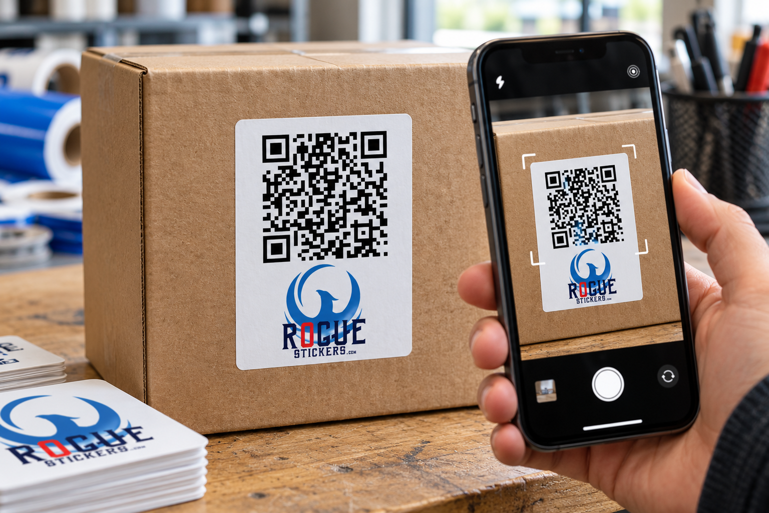
A QR code sticker can turn an ordinary surface into a direct path to digital information. A customer points a phone camera at the code and can be sent to a website, menu, registration page, instruction page, contact form, or another online destination.
Unlike printing a QR code directly on permanent packaging, a sticker gives a business more flexibility. It can be added to boxes, bags, windows, signs, event materials, product inserts, and equipment without redesigning the entire item.
That flexibility is useful, but printing a QR code is not as simple as placing a small black square in the corner of a design. The code must remain large enough, clear enough, and accessible enough for a phone to read it.
What Makes a QR Code Sticker Scannable?
A phone camera must be able to recognize the shape of the code and distinguish its dark and light modules. Modules are the small squares that form the complete QR code.
Reliable scanning depends on several connected factors:
• The printed size of the code
• The distance between the phone and the sticker
• The contrast between the code and its background
• The amount of clear space around the code
• The complexity of the encoded information
• The sharpness of the printed artwork
• The surface and location of the sticker
• Lighting, reflections, curves, and viewing angle
A code may work perfectly on a computer screen and still become difficult to scan after it is reduced, printed, laminated, bent around a container, or placed beneath glare.
How Large Should a QR Code Sticker Be?
There is no single minimum size that works for every QR code sticker. The correct size depends on the code itself, the expected scanning distance, the printing process, and the environment where it will be used.
A small code viewed from a few inches away may scan successfully. That same code may fail if customers are expected to scan it from several feet away.
Codes also become more visually complex as they contain more information. A dense code has more modules packed into the same area. If that code is printed too small, those modules may lose definition.
Choose the finished sticker size according to how customers will actually use it. A code on a product box can be scanned at close range. A code on a storefront window, event display, or wall sign may need to be considerably larger.
Do not reduce a QR code simply because it technically fits inside the artwork. It must remain practical for the person holding the phone.
What Is the Clear Space Around a QR Code?
The empty border surrounding a QR code is called the quiet zone. It separates the code from text, photographs, patterns, logos, and other design elements.
A standard QR code requires a clear margin four modules wide on every side. A module is one of the individual squares within the code.
The quiet zone is part of the functional design. It should not be filled with:
• Text
• Decorative borders
• Background patterns
• Photographs
• Icons
• Additional branding
• Parts of an illustration
Crowding the code can make it harder for a camera to identify where the code begins and ends. If the sticker design feels cramped, enlarge the sticker or simplify the surrounding artwork instead of removing the clear margin.
Do QR Codes Need to Be Black and White?
Black on white is a dependable choice because it creates strong visual separation, but color can be used when sufficient contrast is preserved.
The darker portions of the code should remain clearly different from the light background. Pale colors, similar shades, busy photographs, gradients, and transparent areas can reduce readability.
Reversing the traditional arrangement by placing a light code on a dark background may also create inconsistent results between devices and applications. A conventional dark code on a clean light field is generally the safer option.
Brand colors can still appear elsewhere on the sticker. The QR code does not need to carry the entire visual identity of the design.
Can You Put a Logo Inside a QR Code?
Some QR code generators allow a logo or icon to appear in the center of the code. Error correction can sometimes allow a code to remain readable when a portion is modified or obscured.
That does not make every logo treatment safe.
A logo that is too large can cover essential modules. Decorative changes to the corner markers can also interfere with recognition. The more a code is altered, the more important real testing becomes.
If the logo is already displayed elsewhere on the sticker, keeping the QR code visually simple may produce a more dependable result.
Never assume that a customized code works because the generator successfully created it. Test the exact artwork that will be printed.
Should You Use a Static or Dynamic QR Code?
A static QR code contains its final destination directly. Once created and printed, that destination cannot normally be changed without replacing the sticker.
A dynamic QR code typically directs the user through a managed redirect. The destination may be editable through the provider even after the sticker has been printed.
This can be useful when a business expects a page address or campaign destination to change. However, the continued function of a dynamic code may depend on the service that created or hosts it. Features, tracking, subscriptions, and account requirements differ by provider.
Before ordering a large quantity, confirm:
• Whether the destination can be changed
• Whether the service requires continuing payment
• What happens if the account is canceled
• Whether scan tracking is included
• Whether the redirect domain is trustworthy
• Whether the code will continue working over the intended lifespan
Rogue Stickers does not need access to private account information to print artwork, but the submitted QR code should already be active and tested.
What Should the QR Code Link To?
The best destination is a page that makes sense at the moment the sticker is scanned.
Possible destinations include:
• A restaurant menu
• A product instruction page
• An event registration page
• A warranty form
• A business contact page
• A review request page
• A campaign landing page
• A product authenticity page
• A portfolio or artist page
• A digital catalog
Send customers to a specific useful page instead of making them search through a general home page.
The destination should also work well on a phone. A perfectly printed QR code still creates a poor experience if it opens a slow page, an expired promotion, a desktop only form, or content that does not match the invitation on the sticker.
Should a QR Code Sticker Include Instructions?
A short call to action tells customers why they should scan the code.
Examples include:
• Scan to view the menu
• Scan for care instructions
• Scan to register
• Scan to see available colors
• Scan to contact us
• Scan to learn more
Avoid vague wording when a more useful instruction is available. Customers are more likely to understand the purpose of the code when the expected result is stated clearly.
Keep the instruction close enough to be associated with the code without entering the quiet zone.
Where Should You Place a QR Code Sticker?
Place the sticker where a person can comfortably point a phone at it.
Avoid locations that are:
• Hidden behind handles or packaging folds
• Close to the floor
• High above normal viewing level
• Covered by another label
• Frequently scratched or rubbed
• Strongly curved
• Beneath intense glare
• Difficult to approach
• Likely to become dirty
Curved drinkware, bottles, poles, and containers deserve special attention. A large QR code wrapped around a narrow object may bend enough that a camera cannot see the complete pattern at once.
For a curved surface, a smaller code may lie flatter, but it must still be large enough to print and scan clearly. Testing the actual sticker on the actual object is the safest approach.
Can You Put a QR Code Sticker on a Window?
Yes, but visibility and placement matter.
A code intended to be scanned from outside should face the customer and remain accessible when the business is closed. Reflections, tinted glass, direct sunlight, interior lighting, and viewing distance can all affect scanning.
If the sticker will be viewed through glass, test it from the correct side and at the expected distance. Do not rely only on a close scan under indoor lighting.
Austin and other Texas businesses should also consider how direct sunlight changes glare and visibility during the day. Test the planned location in the morning, afternoon, and evening when practical.
What File Should You Submit for QR Code Sticker Printing?
Use the cleanest version available. Vector artwork is useful because it can be resized without turning the modules into blurry pixels.
If a raster image is used, it should have enough resolution at the final printed size. Do not take a screenshot of a QR code and enlarge it. Enlarging a small screenshot can soften the edges between modules.
The final file should preserve:
• A square overall code shape
• Sharp module edges
• Strong contrast
• The complete quiet zone
• The correct destination
• Adequate resolution
• The intended finished size
Review the exported file after designing the sticker. Some editing programs may compress, blur, recolor, or resample artwork during export.
How Should You Test a QR Code Before Printing?
Test the exact final file rather than an earlier version of the code.
A practical review should include:
Open the finished artwork at its intended physical size.
Scan it with more than one phone when possible.
Confirm that it opens the correct destination.
Check the page on a mobile device.
Print a sample at actual size.
Test the printed sample under realistic lighting.
Test from the distance customers will use.
Apply the sample to the intended surface.
Test again after application.
Confirm that glare, texture, and curvature do not interfere.
Testing several devices does not guarantee that every phone will behave identically, but it can reveal obvious problems before a full order is produced.
What Are the Most Common QR Code Sticker Mistakes?
The most common problems are usually preventable:
• Printing the code too small
• Removing the quiet zone
• Placing the code over a photograph
• Using weak color contrast
• Stretching the code out of proportion
• Uploading a blurry screenshot
• Covering modules with a large logo
• Linking to the wrong page
• Using an expired or restricted destination
• Placing the sticker on a sharp curve
• Testing only on a computer screen
• Forgetting to test the finished sticker
A QR code should be treated as functional artwork. Appearance matters, but reliable scanning is the first requirement.
Plan the Sticker Around the Scan
A successful QR code sticker connects a physical moment to a useful digital destination. That connection depends on more than generating the code.
Think about where the sticker will be placed, how far away the customer will stand, what lighting will be present, and what the customer expects to find after scanning.
Keep the code clear, protect its quiet zone, use strong contrast, and test the final printed size on the real surface.
When the design and destination work together, a custom QR code sticker can make menus, packaging, events, instructions, and customer communication easier to access.
Visit Rogue Stickers to explore custom sticker options for your next business, packaging, or event project.
How to Choose the Right Custom Sticker Size for Any Project
Choosing a custom sticker size sounds simple until you open the order form and see a long list of dimensions. Suddenly, a two inch sticker feels too small, a four inch sticker feels too large, and the artwork on your screen offers no useful sense of scale.
The good news is that there is no single correct size for every sticker. The right choice depends on where the sticker will be applied, what the design needs to communicate, and how close the viewer will be when they see it.
A small logo sticker can look sharp on a product box and disappear on a storefront window. A large decal can be perfect for a cooler and awkward on a reusable bottle. Size changes how the design looks, how easily it fits the surface, and how clearly people can read it.
This guide will help you choose a practical size before you order.
Is There a Standard Size for Custom Stickers?
There is no universal standard size that works for every custom sticker. Common dimensions exist, but they are starting points rather than rules.
Smaller stickers are often used for packaging, seals, and subtle branding. Medium sizes work well for promotional giveaways, laptops, water bottles, and general logo stickers. Larger stickers and decals are better suited to windows, vehicles, coolers, equipment, and places where the design needs to be seen from farther away.
Your design may also change the dimensions you need. A simple icon can remain clear at a small size. A detailed illustration, long business name, website address, or line of small text usually needs more room.
The best question is not, What size do most people order? The better question is, What size will make this design work on its intended surface?
Start With the Surface, Not the Artwork
Before choosing a size, decide where the sticker will most likely be used. Measure the available area with a ruler or tape measure. Do not estimate from memory.
Pay attention to edges, seams, handles, curves, ridges, and moving parts. A sticker may technically fit within the total width of a surface but still cross an area that makes clean application difficult.
For product packaging, measure the flat panel where the sticker will sit. For a bottle or tumbler, measure the usable area between curves. For a laptop, consider whether the sticker should stand alone or leave room for other designs. For a vehicle or window, consider the distance from which the decal needs to be understood.
Once you know the available space, choose a size that leaves the design room to breathe. A sticker that nearly touches every edge can feel crowded even when it fits.
What Size Sticker Works Best for Product Packaging?
Packaging stickers need to fit the package without competing with required product information, shipping labels, or the opening of the container.
For a small box, pouch, jar, or mailer, a sticker around one and a half to three inches may be a useful starting point. The exact choice depends on the package and the amount of information in the design.
A simple logo or seal can work at the smaller end of that range. A sticker that includes a business name, short message, website, or QR code may need more space. If the sticker wraps around an edge or sits on a curved container, test the shape and size before committing to a full order.
Print the design on ordinary paper at the intended dimensions, cut it out, and place it on the package. This quick test reveals scale problems that are difficult to notice on a monitor.
What Size Sticker Is Best for Water Bottles and Tumblers?
For many reusable bottles and tumblers, a sticker around two to three inches on its longest side is a practical place to begin. The right size still depends on the bottle.
Curved surfaces deserve extra attention. A design that is too wide may be harder to apply smoothly because the edges must follow the curve. A compact design with a balanced shape is often easier to position.
Measure the straightest part of the bottle and avoid areas that narrow quickly. If your artwork is a wide rectangle, make a paper test before ordering. This is especially important when the design contains text that must remain level and readable.
What Size Sticker Is Best for a Laptop?
Laptop stickers usually have more flexibility because the lid is flat. A size between two and four inches can work for many designs, depending on the laptop and the visual effect you want.
Choose a smaller size if the sticker will be part of a collection. Choose a larger size if it is meant to be the main design on the lid. Detailed artwork may need more room than a simple logo mark.
Remember that laptop sizes vary. Measure the actual lid and account for any manufacturer logo, raised detail, vent, hinge, or textured area that could affect placement.
What Size Works for Promotional Giveaways?
Giveaway stickers should be large enough to feel valuable but versatile enough to fit the places people commonly use them.
A size around two and a half to three and a half inches is a useful starting range for many logo stickers, event graphics, mascots, and illustrations. It offers room for a strong design without limiting the sticker to one specific surface.
For Austin markets, concerts, restaurant openings, brand events, and community gatherings, portability matters. A sticker that fits easily into a pocket, bag, or merchandise order is easier to distribute. The design should still be clear at actual size, especially if it includes a local reference, event name, or business identity.
How Large Should a Window or Vehicle Decal Be?
Window and vehicle decals usually need to be larger because people see them from farther away. There is no responsible way to recommend one size without knowing the viewing distance, the amount of text, and the available surface.
Start by measuring the exact application area. Then print a paper version of the design at the proposed size and view it from the expected distance. If the business name or message cannot be read quickly, the artwork may need to be larger or simpler.
Do not place a vehicle decal where it interferes with the driver’s view, required markings, lights, sensors, handles, hinges, or moving parts. For business windows, check the glass for existing signs, seams, frames, coatings, and local requirements before ordering or installing a large decal.
Does Sticker Shape Change the Size You Should Order?
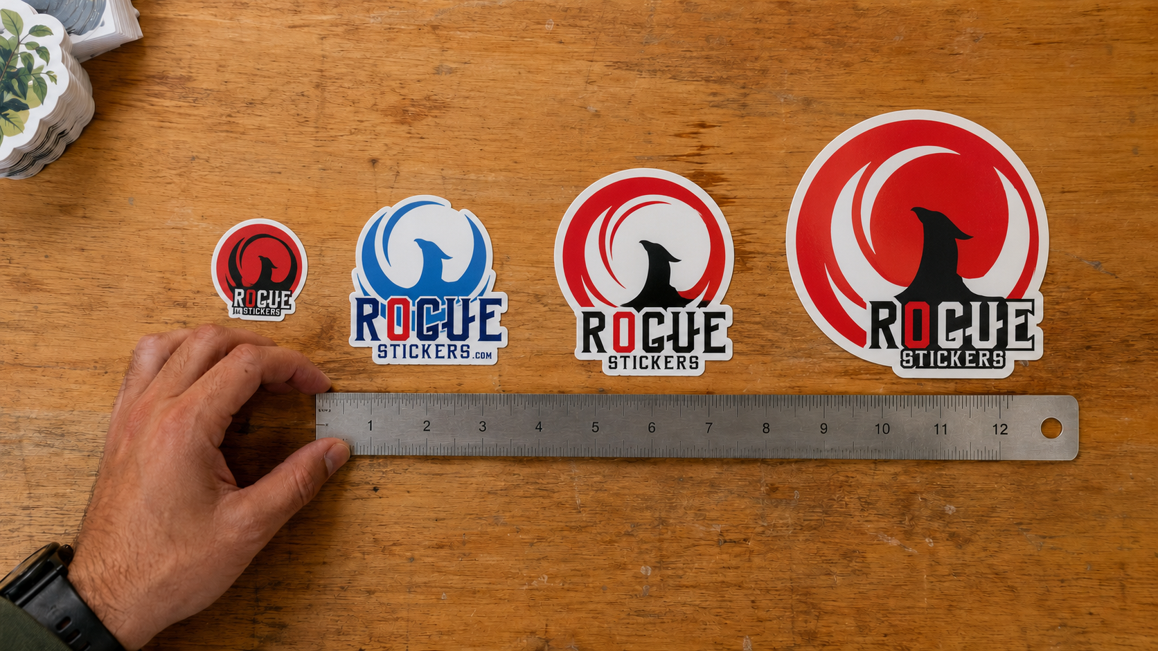
Yes. Sticker dimensions are usually based on the widest and tallest points of the finished shape. Two stickers can share the same listed size and still have very different amounts of visible artwork.
A three inch circle uses space differently from a three inch wide wordmark. A tall mascot may appear larger than a wide, narrow logo even when both share one listed dimension. A die cut shape with several narrow points may also have less visual weight than a solid square or circle.
Look at both width and height before approving the size. Do not rely on only one measurement.
If the design has an unusual outline, place it inside a rectangle that matches the proposed finished dimensions. This shows how much of the available area the actual artwork will occupy.
How Does Design Detail Affect Sticker Size?
The more information a sticker contains, the more space it usually needs. Fine lines, small type, detailed illustrations, QR codes, and multiple brand elements can become difficult to see when reduced.
Before ordering, view the artwork at its actual printed size. Do not judge it while it fills a large computer screen. Print a paper copy or set the document view to match the final physical dimensions as closely as possible.
Ask these questions:
Can the main image be recognized immediately?
Is every important word easy to read?
Does the design still have clear space around its elements?
Are thin lines and small details still visible?
Does the design look balanced in the chosen shape?
If the answer to any of these questions is no, increase the sticker size or simplify the artwork.
Should You Choose a Smaller Sticker or Simplify the Design?
Sometimes the application requires a small sticker. In that case, making the sticker larger is not an option. The better solution is to simplify the design.
Remove secondary text, shorten the message, strengthen contrast, and focus on one recognizable visual idea. If the full logo contains a long tagline, consider using the logo mark without the tagline. If a detailed illustration becomes muddy at a small size, create a simplified version for stickers.
Good sticker design is not about fitting everything onto the surface. It is about making the most important element clear.
How Can You Test Sticker Size Before Ordering?
An actual size paper test is one of the easiest ways to avoid choosing the wrong dimensions.
Set the artwork to the proposed finished size.
Print it at one hundred percent scale on ordinary paper.
Cut around the approximate sticker shape.
Place it on the intended surface with removable tape.
View it from the distance at which people will normally see it.
Test a second size if the first version feels too small or too dominant.
This does not reproduce the color, material, adhesive, or finish of the final sticker. It does provide a reliable sense of physical scale.
What Should You Review in the Digital Proof?
The proof is your final opportunity to confirm how the sticker will be printed and cut. Rogue Stickers provides an online proof before production, so review it carefully. Rogue Stickers proof information
Confirm the finished dimensions, spelling, artwork orientation, border, cut line, and overall shape. Make sure important text and design elements are not too close to the cut edge. If the size shown in the proof is not what you expected, ask for clarification before approving it.
A proof can confirm the production layout, but it cannot decide whether the sticker will look appropriately sized on your bottle, box, laptop, cooler, window, or vehicle. That decision should be made through measurement and an actual size test.
Final Checklist for Choosing a Custom Sticker Size
Before placing your order, confirm the following:
You measured the actual application surface.
The sticker avoids seams, sharp curves, handles, hinges, and moving parts.
The main artwork is clear at the finished size.
All important text is readable.
The width and height match the shape of the design.
You printed a paper test at actual size.
You reviewed the finished dimensions in the proof.
Choose the Size That Serves the Design
The best custom sticker size is not necessarily the size everyone else orders. It is the size that fits the intended surface, keeps the artwork clear, and gives the design the presence it needs.
Measure first. Test the design at actual size. Simplify it when necessary. Then review the proof with the final application in mind.
Whether you are creating packaging stickers for a Texas business, giveaway stickers for an Austin event, or durable decals for everyday use, thoughtful sizing will help the finished piece look intentional from the moment it is applied.
How to Prepare Artwork for Custom Sticker Printing: The Ultimate File Setup Guide (CMYK, Bleeds, and Cut Lines)
If you have ever opened a proof from a print shop and thought “that is not what I designed,” you already know why file setup matters so much. Stickers are unforgiving. A tiny mistake in color mode, resolution, or bleed can turn a crisp logo into a blurry mess or a clean die cut into something with a stray white edge.
The good news is that once you understand a handful of print rules, you can set up artwork correctly every single time. This guide walks through everything our team at Rogue Stickers looks for when we review a customer file, so you can catch problems before you ever hit submit.
Vector Versus Raster: Know What You Are Working With
Every image file falls into one of two categories.
Vector files are built from mathematical paths rather than pixels. Programs like Adobe Illustrator, Affinity Designer, and Inkscape create vector files (usually saved as .ai, .eps, or .svg). Because vectors are math, not pixels, they can be scaled up or down to any size with zero loss in quality. This is why print shops love vector logos and text. If your design is mostly typography, icons, or flat illustration, vector is almost always the better format.
Raster files are made of pixels, like photographs. Formats such as .jpg, .png, and .psd are raster. Raster art can look great, but only if it starts at a high enough resolution. If you enlarge a small raster image, you are stretching a fixed number of pixels, and the result gets soft or blocky.
A common mistake we see is a customer pulling a logo off their own website. Web graphics are almost always low resolution raster files sized for screens, not print, and they fall apart the moment they are enlarged for a three inch sticker. If you only have a web logo, ask the original designer for the vector source file before you order.
Resolution: Why 300 DPI Is the Standard
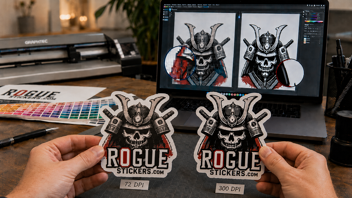
If your artwork is raster based, resolution is everything. The print industry standard is 300 DPI (dots per inch) at the final, actual output size of your sticker.
This part trips people up constantly: DPI only means something in relation to physical size. A file that is 300 DPI at 2 inches by 2 inches is not the same file once you stretch it to 6 inches by 6 inches. If you resize the canvas without adding real pixel information, the effective resolution drops and the print will look blurry or pixelated.
A quick way to check this in Photoshop is to go to Image, then Image Size, and look at the resolution field alongside the document dimensions. If you are designing a 4 inch sticker, make sure the document is set to 4 inches at 300 DPI from the very start, not scaled up afterward.
Color Mode: RGB Versus CMYK
Screens and printers speak two different color languages, and this is one of the biggest sources of “why does my printed sticker look different than my screen” complaints.
Your monitor displays color using RGB, which stands for red, green, and blue light. RGB can produce extremely bright, glowing colors, especially neons and vivid blues, because it is generating color with light itself.
Commercial printers, including the equipment used for custom stickers, build color using CMYK, which stands for cyan, magenta, yellow, and black ink. CMYK has a smaller range of achievable colors than RGB, particularly in the neon and deep blue range. When an RGB file gets converted to CMYK for print, colors can shift and appear slightly duller or different than what you saw on screen.
The fix is simple: convert your file to CMYK yourself before you export it, rather than letting the printer’s software make that decision at the last minute. In Illustrator or Photoshop, this is done under File, then Document Color Mode, or File, then Convert to Profile. Reviewing your design in CMYK ahead of time means no surprises when the proof arrives.
Bleed, Cut Lines, and Safe Margins
This is the part that separates a professional file from an amateur one, and it is where die cut stickers most often go wrong.
Bleed is extra artwork that extends past the edge of where your sticker will actually be cut. Because cutting machines have a small margin of physical movement, if your background color or image stops exactly at the cut line, even a slight shift can leave a thin white sliver along the edge. Extending your background by roughly one eighth of an inch beyond the cut line, a standard bleed allowance used across the printing industry, gives the machine room to cut without exposing white paper. As always with a specific vendor’s requirements, it is worth confirming the exact bleed measurement Rogue Stickers requests for your particular sticker shape on our artwork guidelines page.
The cut line marks exactly where your sticker’s final shape will be cut. For custom die cut stickers that follow the outline of your design, this line traces the contour of your artwork.
The safe margin is an inner boundary, typically kept about one eighth of an inch inside the cut line, where you should keep all important text, logos, and details. Anything placed right at the cut line risks being trimmed off if the cut shifts even slightly.
Picture three nested outlines: the outer one is your bleed, the middle one is the actual cut line, and the inner one is your safe zone for text and important graphics. Keeping this structure in mind while you design will save you from misaligned or clipped prints.
Common Mistakes That Lead to Blurry Prints or Bad Cuts
Pulling a logo from a website instead of requesting the original vector file
Designing at a small size and scaling up later instead of building at final print size from the start
Leaving text or logos too close to the edge with no safe margin
Forgetting bleed entirely, which is the number one cause of white edges on die cut stickers
Exporting in RGB and being surprised when printed colors look different than the screen
Flattening a file with a transparent background into a white background by accident, especially common when exporting PNGs from certain design tools
Templates to Get You Started
Working from a template built to the correct dimensions is the easiest way to avoid all of the mistakes above. We recommend starting with a template sized in Illustrator, Photoshop, or Canva that already includes bleed, cut line, and safe margin guides for your chosen sticker shape and size. If you are not sure which starting point fits your project, our team can point you to the right one, or you can browse current options directly at Rogue Stickers before you upload your file.
Before You Upload
Run through this short checklist:
Is your file vector, or if raster, is it at least 300 DPI at final size?
Is your document set up in CMYK?
Does your background extend into the bleed area?
Is important text or artwork kept inside the safe margin?
Does your cut line match the shape you actually want?
Getting these five things right before you upload means fewer rounds of proofing, a faster turnaround, and a sticker that actually matches what you designed. If you run into anything unclear along the way, reach out to our team at Rogue Stickers and we are happy to look over your file before it goes to print.
A note on accuracy: bleed and margin figures above reflect standard practice across the sticker printing industry. I was not able to verify Rogue Stickers’ exact current bleed specifications, template downloads, or page URLs from the information available to me, so please confirm those specific numbers and links with your prepress or production team before publishing this post, and swap in the real template and guidelines URLs once confirmed.
Why Your Custom Sticker Design Looks Blurry (How to Prep 300 DPI Artwork for Clear Printing)
You designed something you were proud of. It looked crisp and clean on your screen. Then the proof came back and the edges looked soft, the colors felt a little off, and that fine detail you loved just turned into a smudge. If that has happened to you, you are not alone, and more importantly, it is not your fault. It is almost always a resolution or color space problem, and both are completely fixable once you understand what is actually happening between your screen and the printed sticker in your hand.
Screens Glow. Ink Sits Still.
Your monitor builds color with light, using a mix of red, green, and blue known as RGB. Every pixel is glowing at you, which is why colors on a screen can look almost impossibly vibrant. Printers do not work that way at all. They lay down actual ink using cyan, magenta, yellow, and black, known as CMYK. Ink does not glow. It absorbs and reflects light, which is a completely different physical process than a backlit screen.
That difference is why a neon green or an electric blue that looks stunning on your laptop can look muted once it hits vinyl. It is not a printing error. It is physics. When you submit artwork through Rogue Stickers, we always recommend working in CMYK from the start rather than converting an RGB file at the last minute, because the conversion is where the most noticeable shifts happen.
What 300 DPI Actually Means for a 3 Inch Sticker
DPI stands for dots per inch, and it describes how much image information exists in a printed inch of space. On a screen, images are measured in pixels, and most web graphics are built for 72 pixels per inch because that is all a monitor needs to look sharp from a normal viewing distance.
Print is a different game entirely. At 300 DPI, a 3 inch sticker needs 900 dots of information packed into that width. If your file was built for the web at 72 DPI, that same 3 inch sticker only has about 216 dots to work with, and the printer has to stretch that thin amount of data across a much bigger physical space. That stretching is exactly what creates the blur, the pixelation, and the fuzzy text edges people complain about.
The good news is that vector files sidestep this problem completely. Formats like AI, EPS, or PDF built from vector artwork are made of math and paths rather than pixels, so they scale to any size without ever losing sharpness. If your logo or design was built in Illustrator or a similar vector program, you are already in great shape. If it started as a photo or a raster file, just make sure it was created large enough, or built at 300 DPI at the actual print size, before you upload it for your custom die cut stickers.
Bleed and Safe Zones, the Two Words That Save Your Design
Even a perfect file can print poorly if it is not set up with bleed and safe zones in mind. Bleed is the extra artwork you extend past your actual cut line, usually about an eighth of an inch, so that any tiny shift in the cutting blade does not leave a thin sliver of white at the edge. Safe zone is the opposite idea. It is the buffer you keep important text or logos away from the edge, so nothing critical gets trimmed off if the cut shifts slightly the other direction.
These two concepts are the single most common reason a first time customer gets nervous about ordering stickers, and it makes sense. Nobody wants to pay for a design only to receive it with a chopped off edge or a stripe of white where their background should be.
Why We Proof Before We Print
This is exactly where Rogue Stickers does things differently than a fully automated print shop. Every order we produce, whether it is a set of circle stickers, a run of clear vinyl stickers, or a batch of large die cut transfers, goes through a human review before it ever touches a print head.
Our team looks at your file for exactly the issues we just walked through. We check your resolution, we check your bleed, and we check your safe zone, and then we send you a digital proof so you can see precisely how your design will look before we commit it to vinyl. If something is off, we tell you, and we help you fix it. Nothing goes to production until you approve it.
That extra step exists because we would rather catch a problem on a screen than have you discover it after opening a box. A fully automated system can process your file in seconds, but it cannot look at your artwork and notice that your text is sitting a little too close to the trim line. A person can, and that is the difference between a sticker that looks fine and a sticker that looks flawless.
Getting It Right the First Time
If you are getting ready to order, keep three things in mind. Build or export your file in CMYK, work in vector format whenever possible or set your raster file to 300 DPI at true size, and always include bleed while respecting your safe zone. Then let our proofing process catch anything you might have missed.
Ready to see your design done right? Browse our full sticker catalog or head straight to our custom die cut sticker page to upload your artwork and get your proof today.
One of the most common questions people ask before ordering custom stickers is simple:
“Are your custom stickers waterproof?”
At Rogue Stickers, the answer is yes — our custom vinyl stickers are designed to be waterproof, durable, and made for real-world use. Whether you are putting them on a water bottle, cooler, laptop, car window, hard hat, tumbler, boat, storefront window, or outdoor sign, our stickers are built to handle moisture, rain, splashes, and everyday wear.
But there is a little more to it than just saying “waterproof.” Let’s break down what waterproof stickers really are, what makes them last, and how to choose the right custom sticker for your project.
What Makes a Sticker Waterproof?
A waterproof sticker is made from materials that do not absorb water. Paper stickers, for example, can wrinkle, tear, fade, or peel when they get wet. That is why paper stickers are usually best for packaging, indoor use, short-term labels, or dry environments.
Waterproof stickers are different.
At Rogue Stickers, we use high-quality vinyl for our custom stickers. Vinyl is a durable, flexible material that resists water much better than paper. When printed properly and finished correctly, vinyl stickers can stand up to rain, hand washing, ice chests, drink coolers, outdoor weather, and regular use.
The key parts of a quality waterproof sticker are:
Vinyl material – This is the base of the sticker and helps prevent water damage.
Professional printing – Quality inks help the design stay bold, sharp, and colorful.
Strong adhesive – A good adhesive helps the sticker stay in place even when exposed to moisture.
Optional laminate – Lamination adds an extra protective layer against scratches, UV exposure, and wear.
When all of those elements work together, you get a sticker that looks good and performs well.
Are Vinyl Stickers Waterproof or Water-Resistant?
This is where people sometimes get confused. Many companies use the words waterproof and water-resistant in different ways.
A quality vinyl sticker can handle water extremely well. It can get wet, be exposed to rain, and be used on items like tumblers, bottles, coolers, and vehicles. That is why vinyl stickers are commonly referred to as waterproof stickers.
However, no sticker is completely indestructible. Long-term soaking, harsh chemicals, pressure washing, extreme heat, or rough surface application can affect the life of any sticker.
So the best way to say it is this:
Our custom vinyl stickers are waterproof for normal everyday use and outdoor exposure. They are made to handle water, weather, and real life — but proper application and care will always help them last longer.
Can You Put Waterproof Stickers on Water Bottles?
Yes. Water bottles are one of the most popular uses for custom waterproof stickers.
If you want stickers for water bottles, tumblers, cups, or drinkware, vinyl is the right choice. It holds up much better than paper and keeps your design looking clean after repeated handling and exposure to moisture.
For best results, apply your sticker to a clean, dry, smooth surface. Make sure the bottle is free of dust, oil, soap residue, or moisture before applying the sticker. After applying, press firmly and allow the adhesive time to bond before washing or getting it wet.
We recommend hand washing items with stickers whenever possible. Dishwashers use heat, pressure, and detergents that can be hard on any sticker over time.
Are Custom Stickers Good for Outdoor Use?
Yes, custom vinyl stickers are a great choice for outdoor use.
Many customers use our stickers for:
Car windows Truck decals Business windows Outdoor signage Coolers Boats Construction equipment Hard hats Toolboxes Trailers Event giveaways Brand promotions
Outdoor stickers need to handle sun, rain, wind, dirt, and temperature changes. That is why material quality matters. A cheap sticker may look fine on day one, but it can fade, crack, peel, or curl quickly if it is not made with the right vinyl and printing process.
At Rogue Stickers, we focus on producing stickers that are made to look professional and last. Whether you need a clean logo sticker, product label, promotional giveaway, or outdoor decal, we help you choose the right option for how the sticker will be used.
Will Waterproof Stickers Fade in the Sun?
Waterproof and UV-resistant are not exactly the same thing.
A sticker can be waterproof but still fade over time if it is exposed to strong sunlight every day. This is especially important in places like Texas, where heat and sun exposure can be intense.
For stickers that will be outside long term, we recommend using durable vinyl with a protective finish or laminate. Lamination helps protect the printed design from scratches, weather, and UV exposure, which can extend the life of the sticker.
If you are ordering stickers for vehicles, windows, outdoor signs, boats, or equipment, let us know how you plan to use them. We can help point you toward the best material and finish for your project.
How Long Do Waterproof Stickers Last?
The lifespan of a custom waterproof sticker depends on several things:
Where the sticker is applied How much sun exposure it gets Whether it is laminated How often it gets handled or washed The surface it is applied to The weather conditions it faces
A sticker on a laptop may last for years because it is mostly indoors and protected. A sticker on a water bottle may wear faster because it is handled and washed often. A sticker on a car window may last a long time, but sun exposure and weather will eventually affect it.
The better the material, print quality, adhesive, and finish, the longer the sticker will last.
How to Make Your Custom Stickers Last Longer
Even the best sticker needs to be applied correctly. Here are a few simple tips:
Start with a smooth, clean surface. Wipe away dirt, dust, oils, and moisture before applying. Avoid textured, dirty, rusty, or greasy surfaces. Apply the sticker slowly to prevent bubbles. Press firmly around the edges. Give the adhesive time to bond before getting it wet. Hand wash drinkware when possible. Avoid scraping or pressure washing over the sticker.
These small steps can make a big difference in how long your sticker looks fresh and professional.
Why Businesses Choose Waterproof Custom Stickers
Waterproof stickers are not just fun. They are one of the most affordable and effective ways to promote a brand.
A good sticker can turn a water bottle, laptop, cooler, window, or vehicle into a mini billboard. For businesses, events, breweries, restaurants, gyms, outdoor brands, schools, bands, and local shops, custom stickers are an easy way to build recognition and give customers something they actually want to keep.
When your sticker is waterproof, people are more likely to use it because they know it will hold up.
Order Custom Waterproof Stickers from Rogue Stickers
So, are your custom stickers waterproof?
Yes. Rogue Stickers offers custom vinyl stickers designed to handle water, weather, and everyday use.
Whether you need stickers for your business, event, product packaging, vehicle, water bottle, or outdoor promotion, we can help you create high-quality custom stickers that look sharp and last.
When you want stickers that feel professional, hold up in real life, and make your brand look good, Rogue Stickers has you covered.
What Makes an Effective Sticker Design? A Business Owner’s Complete Guide
By Rogue Stickers
Most business owners think about sticker design the wrong way.
They open their brand guidelines, drop their logo onto a square template, pick a background color, and send it to print. The result is a sticker that looks fine, but one that nobody actually wants to put on their laptop, their water bottle, or their car. It sits in a bowl on the counter, gets occasionally grabbed by a polite customer, and quietly disappears into a drawer.
Effective sticker design is not logo design. It’s not ad design. It’s not even packaging design. It’s a discipline with its own rules, its own success criteria, and its own psychology — and business owners who understand those rules consistently outperform competitors who treat sticker design as an afterthought.
This guide breaks down exactly what separates a sticker that people keep and display from one that ends up in the trash, and how to apply those principles to your own brand.
Why Sticker Design Requires a Different Mindset
Before diving into principles, it’s worth reframing what you’re actually trying to accomplish with a sticker design.
A banner ad is trying to interrupt someone into clicking. A product label is trying to communicate information and drive a shelf decision. A sticker is trying to do something much harder: it’s trying to convince someone to voluntarily display your brand on their personal belongings as an expression of their identity.
That’s an extraordinary ask. People are deeply selective about what goes on their laptop lid or their Nalgene. Those surfaces are curated self-portraits. Every sticker on them was chosen because it communicates something the owner wants the world to know about them, their values, their humor, their tribe, their aesthetic.
Your sticker isn’t competing with other brand stickers. It’s competing with every other sticker a person finds appealing. It needs to earn its place purely on the strength of its design, personality, and cultural resonance. The brand association is secondary, if the design is good enough, the branding comes along for the ride.
This mindset shift, from brand communication to object someone wants to own, is the foundation of every great sticker design decision.
The 7 Principles of Effective Sticker Design
1. Simplicity Always Wins
The most common mistake in sticker design is trying to include too much. Business owners want their logo, their tagline, their website, their phone number, their color palette, and their core brand message — all on a 2-inch circle.
The result is visual noise. From any distance greater than arm’s length, the design collapses into an unreadable smudge. On curved surfaces like water bottles, complex designs become even more distorted and illegible.
The best sticker designs are radically simple. They identify the one thing — one image, one phrase, one icon — that best represents the brand’s personality and build the entire design around it. Everything else is ruthlessly cut.
Ask yourself: if someone sees this sticker from across a coffee shop, what will they register? If the answer is “not much,” simplify until there’s only one clear visual idea left.
Great references for this principle: the Nike swoosh sticker, the Apple logo sticker (so simple it shipped inside every Mac for decades), or any of Patagonia’s mountain silhouette designs. One strong, instantly recognizable visual. Nothing more.
2. High Contrast Is Non-Negotiable
Stickers live in unpredictable environments — under fluorescent office lights, in bright outdoor sun, on dark laptop lids, on light-colored walls. A design that looks beautiful on your monitor at home may become nearly invisible in real-world conditions.
High contrast between foreground elements and background ensures your design remains legible across all these environments. This means:
Dark design on light background or light design on dark background — avoid middle-ground combinations where neither element pops.
Bold, thick letterforms rather than thin, delicate typography that disappears at small sizes.
Solid fills over gradients, especially for text and key graphic elements. Gradients can look stunning on screen and muddy on vinyl.
Enough breathing room around key elements so they read clearly without crowding.
Test your design by printing a small version in black and white. If it loses legibility, the contrast needs work.
3. Typography Must Work at Small Scale
If your sticker includes text — and many of the best ones do — typography is one of the most technically demanding aspects of the design.
Type that looks elegant and refined at large display sizes often becomes illegible at sticker scale. Fine serifs disappear. Tight letter spacing causes letters to bleed together. Decorative scripts become unreadable swirls.
Effective sticker typography follows these rules:
Choose bold, clear typefaces. Sans-serif fonts with consistent stroke width (like Futura, Gotham, or even a well-chosen geometric display font) tend to hold up at small sizes. If you’re using a branded serif, test it carefully at actual sticker dimensions.
Limit text to the essential. If you can’t read it at arm’s length in three seconds, cut it. This usually means a maximum of one short phrase, a brand name, or a single tagline — not multiple lines of copy.
Size up letter spacing slightly. Slightly more space between letters than feels natural at large sizes helps readability when the design is reduced.
Avoid text smaller than 8 points in the final printed size. Below that threshold, text on vinyl tends to fill in and blur, especially if the printing process involves any ink spread.
4. Choose a Shape That Enhances the Design
Most business owners default to a rectangle, square, or circle — and then design within those constraints. But die-cut stickers, which are cut to the precise shape of the design itself, are often far more effective because the shape becomes part of the visual impact.
A die-cut sticker of a mountain silhouette, a coffee cup, a lightning bolt, or a stylized animal feels more finished and intentional than the same design floating inside a rectangle. It looks like a designed object rather than a piece of paper with something printed on it.
Consider how the shape of your sticker communicates personality. Round shapes feel friendly and approachable. Sharp angles and irregular forms feel edgy and dynamic. Organic, irregular outlines feel natural and hand-crafted. The shape is doing design work before the viewer even processes the imagery or text.
If budget is a concern, start with die-cut. The premium over standard shapes is small at volume, and the difference in perceived quality is significant.
5. Color Strategy: Stand Out Without Chaos
Color is one of the most powerful tools in sticker design — and one of the most frequently misused.
Many business owners feel compelled to reproduce their full brand color palette on every sticker. The result is often a visually noisy design that competes with itself. Effective sticker color strategy is usually more restrained:
One or two dominant colors. The most memorable sticker designs rarely use more than two or three colors. Each additional color adds complexity and reduces visual impact.
Consider the surfaces where stickers live. Laptop lids tend to be silver, black, or white. Water bottles are often black, white, or metallic. Car bumpers are body-colored. A sticker that pops against most of these backgrounds will get displayed more than one that blends in.
Use white or transparent as your friend. A clean white background makes almost any color combination pop. Alternatively, a clear/transparent sticker with opaque elements allows the surface underneath to become part of the design — a sophisticated approach that feels premium.
Neon and high-saturation colors attract attention. For brands targeting younger demographics or visual subcultures like skateboarding, streetwear, or outdoor sports, saturated, almost-aggressive color choices signal cultural belonging.
Muted, earthy palettes signal quality and craft. For premium food and beverage brands, artisan producers, or lifestyle brands positioning on authenticity, restrained earthy palettes communicate taste and refinement.
Always proof physical color samples before your full print run. Colors render very differently on vinyl than they appear on screen.
6. Personality Over Perfection
Here is the design truth that most business owners find hardest to accept: a sticker with a strong personality and imperfect execution will outperform a technically flawless sticker with no character every single time.
People display stickers to express who they are. They’re not drawn to perfection — they’re drawn to personality. To voice. To something that feels human rather than corporate.
This is why the most beloved brand stickers often lean into humor, irreverence, specificity, or creative weirdness rather than polished professionalism. A craft brewery whose sticker says “Beer O’Clock Somewhere” will get more organic placements than one that produces a pristine rendering of their logo on a white oval. A local running shop whose sticker reads “0.0 — Just Kidding” connects with its community in a way that a corporate logo never can.
The question to ask is: does this sticker feel like it came from a human, or does it feel like it came from a committee? The former gets displayed. The latter gets discarded.
This doesn’t mean sloppiness is a virtue — execution quality still matters. But personality is the soul of effective sticker design, and it should guide every creative decision.
7. Design for the Long Game
Stickers are one of the few marketing assets that can outlast the campaign that created them. A sticker applied to a laptop in 2024 might still be generating impressions in 2028. That longevity is a major advantage — but it also means design decisions made today have a long tail.
Effective sticker design avoids elements that date quickly: trend-dependent visual styles (think of designs that scream “this was made during a specific era”), topical cultural references that lose meaning over time, or specific product names or offers that may change.
Instead, lean toward timeless visual concepts — strong graphic forms, wit that transcends the moment, imagery rooted in the brand’s enduring identity rather than its current campaign. The sticker should represent what your brand will still stand for five years from now.
This is also why limited-edition sticker series can be a smart strategy: they allow you to create timely, trend-responsive designs under a separate banner while keeping your core sticker range evergreen.
Common Sticker Design Mistakes to Avoid
Even experienced designers make these errors when working on stickers specifically. Watch for them in your own review process.
Too many elements competing for attention. Logos, taglines, websites, social handles, QR codes — each element added dilutes the impact of all the others. Pick one primary element and support it with at most one secondary element. Nothing more.
Designing at large scale and reducing without testing. A design that looks great at 10 inches may become illegible at 2 inches. Always proof your design at actual print size — printed on paper if necessary — before committing to a production run.
Ignoring bleed and safe zones. For die-cut stickers especially, elements placed too close to the edge risk being cut off in production. Work with your printer’s templates and respect their bleed guidelines.
Choosing fashionable over functional typography. The ultra-thin, delicate display fonts trending in brand design right now are often terrible choices for sticker applications. Prioritize legibility over on-trend aesthetics.
Neglecting material choice. A beautifully designed sticker on cheap paper stock signals a cheap brand. Weatherproof vinyl, quality lamination, and appropriate finish (matte vs. gloss vs. holographic) are as much a part of the design as the artwork itself. Match the material to your brand positioning.
Using raster images at low resolution. Sticker printing exposes every pixel of a low-resolution image. All artwork should be delivered as vector files (AI, EPS, or SVG) or as high-resolution raster files (minimum 300 DPI at print size). Never scale up a logo saved from a website — the results will be visibly poor.
Working With a Designer vs. Doing It Yourself
If you have design skills or access to quality tools, creating your own sticker artwork is absolutely viable — especially for simple typographic or icon-based designs. Platforms like Adobe Illustrator, Affinity Designer, or even Canva (for simpler applications) can produce solid results when you understand the principles above.
However, if your brand’s visual identity is core to your competitive differentiation — if the way your brand looks is a significant part of why customers choose you — working with an experienced graphic designer is worth the investment.
When briefing a designer, give them this single clear objective: design something people will genuinely want to put on their belongings. Not something that communicates your brand messaging. Not something that fits neatly into your brand guidelines. Something a person would choose to display as a piece of their identity. That brief produces very different — and far more effective — results.
From Design to Print: Final Checklist
Before sending your sticker design to production, work through this checklist:
Is the design legible at actual print size, viewed at arm’s length?
Is there strong contrast between foreground and background elements?
Have you proofed all text for spelling, spacing, and size?
Is all artwork provided in vector format or at minimum 300 DPI?
Have you accounted for bleed and safe zone requirements?
Does the die-cut shape (if applicable) enhance rather than distract from the design?
Have you ordered a physical proof before committing to the full print run?
Does the material and finish match your brand’s positioning?
Does the design have a personality distinct from a generic corporate logo treatment?
Will this design still feel relevant and on-brand in three to five years?
If you can answer yes to all ten, you’re ready to print.
The Bottom Line: Design That Earns Its Place
The business owners who get the most value from sticker marketing are not the ones who spend the most on printing — they’re the ones who invest in designs that people actually want. A single exceptional sticker design, printed well and distributed thoughtfully, will generate more brand equity than a dozen mediocre ones.
Great sticker design is simple, high-contrast, appropriately typeset, interestingly shaped, strategically colored, full of personality, and built to last. It asks not “does this represent our brand?” but “would someone choose to make this a part of their identity?” — and it doesn’t stop until the answer is genuinely yes.
Get that right, and your stickers will do the rest.
Thinking about creating your first custom sticker or refreshing an existing design? Start with one strong concept, brief a skilled designer with a human-centered objective, and always proof physically before printing at scale. A sticker done right is one of the most cost-effective brand investments you’ll ever make.
Designing the perfect custom sticker can seem overwhelming, but it doesn’t have to be! Whether you’re creating stickers for your business, personal project, or promotional material, getting the design right is crucial. This guide will walk you through the essential aspects of sticker design, including file formats, resolution, color choices, and tips for creating eye-catching stickers.
1. Start with the Right Design Idea
Before you dive into technical aspects like file formats or colors, it’s important to nail down your design concept. What message or vibe do you want your sticker to communicate? Whether it’s a bold logo, a fun quote, or intricate artwork, your design should reflect your brand or personal style.
Tip: Keep your target audience in mind while designing. What will catch their eye and make them want to stick your sticker everywhere?
2. Use the Right File Format
Choosing the right file format is essential for ensuring your sticker design comes out as crisp and clear as possible. The best formats for custom sticker printing are:
Vector files (.ai, .eps, .svg): These formats use mathematical equations to define shapes, so your design can be scaled without losing quality.
Raster files (.jpg, .png, .tiff): These are pixel-based formats. Make sure the image resolution is high enough to avoid pixelation when printed.
Tip: Always use vector files for logos or designs with sharp edges, as they ensure the best quality at any size.
3. Optimize Your Resolution
Resolution is the number of pixels per inch (PPI) in your design. For high-quality sticker design, the standard resolution should be 300 DPI (dots per inch). This ensures your design will print with fine detail and clarity.
Tip: If you’re working with raster images (like .jpg or .png files), ensure they are at least 300 DPI at the size you want to print the sticker. This will help your design stay crisp and sharp.
4. Choose the Right Colors
When designing your custom sticker, selecting the right colors is key to creating something that stands out. It’s important to consider how the colors will look when printed.
CMYK (Cyan, Magenta, Yellow, Black): This is the color model used in printing. If you’re designing for print, always use CMYK color mode to ensure the colors you see on-screen match what will be printed.
RGB (Red, Green, Blue): This is the color model used for digital screens, so avoid using RGB for print designs.
Tip: Bright colors and high-contrast combinations tend to grab attention. If your design includes text, make sure the text color contrasts well with the background for readability.
5. Consider the Sticker Shape and Size
The shape of your sticker can significantly impact its design. Custom die-cut stickers allow for any shape, while standard shapes (like circles, squares, or rectangles) can be a more cost-effective option.
Tip: Keep in mind the practical aspects of your sticker’s use. Will it fit nicely on a laptop, phone, or product packaging? Consider how the size and shape will affect the overall appearance.
6. Make It Eye-Catching
Your sticker design should be something that captures attention. Here are a few design tips to make your stickers stand out:
Use bold fonts: Choose fonts that are easy to read, even at a small size.
Simplicity is key: Avoid overcrowding the design with too much detail. A clean, minimalistic design is often more impactful.
Use white space effectively: Don’t be afraid of empty space. It helps highlight key elements of your design and gives the sticker a more polished look.
7. Make It Eye-Catching
Once your design is finalized, it’s time to prepare it for printing. Double-check these details before submitting your design for custom stickers:
Check the bleed area: Make sure the design extends slightly beyond the cut line (this is called the bleed) to avoid any white edges when the sticker is cut.
Review the proof: Most printers will provide a digital proof before production. Make sure everything looks perfect before you approve it.
Final Thoughts on Sticker Design
Designing custom stickers can be a fun and rewarding process. By considering elements like file formats, resolution, colors, and layout, you can create stickers that look great and perform well for your intended use. Whether it’s for business, personal use, or a special project,perfect sticker design is all about making an impact with your design.
Need help creating the perfect custom stickers? Contact us today and get started with your design!