Posted on

Matte vs Glossy Stickers: Which Finish Fits Your Design?

Matte vs Glossy Stickers: Which Finish Fits Your Design?

What Is the Difference Between Matte and Glossy Stickers?

The main difference is how the surface interacts with light.

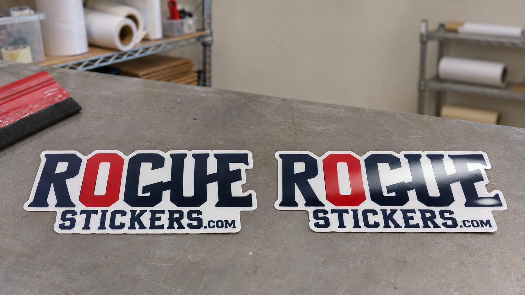
Glossy stickers have a smooth, reflective finish. Light bounces from the surface, creating noticeable shine. This can make colors and dark areas appear richer.

Matte stickers diffuse more light. The surface has little visible shine, which creates a softer and more understated appearance.

The printed artwork may be identical, but the finish can change how the design feels. Gloss tends to look energetic and bright. Matte often feels calm, modern, or refined.

Neither option is automatically better. The right choice depends on the artwork, placement, lighting, and impression you want to create.

Do Colors Look Better on Glossy Stickers?

Gloss can make saturated colors appear deeper and more vivid. Bright illustrations, bold logos, photographs, and artwork with strong contrast can benefit from that extra visual energy.

This does not mean matte produces poor color. Matte simply creates a softer presentation. Muted palettes, vintage artwork, natural colors, and minimal branding may look more intentional without a reflective surface.

Ask what the artwork is supposed to communicate.

If the design should feel loud, colorful, and energetic, gloss may support that goal. If it should feel subtle, warm, or sophisticated, matte may be a better match.

Does Matte Reduce Glare?

Yes. Matte surfaces reflect less concentrated light than glossy surfaces.

That can make matte stickers easier to view beneath strong overhead lighting, near windows, or in photographs. Small text and fine details may also remain easier to see when reflections are reduced.

Glossy stickers can develop bright highlights under direct light. The artwork remains printed beneath the finish, but glare may temporarily hide part of the design from certain angles.

Consider the final environment. A sticker displayed beneath retail lighting may benefit from reduced reflection, while a colorful giveaway sticker may benefit more from glossy shine.

Which Finish Shows More Fingerprints?

Glossy surfaces tend to make fingerprints and smudges more noticeable, especially on dark artwork.

Matte finishes are usually more forgiving because their surface scatters light and hides small marks more effectively.

This difference matters for stickers that will be touched often, such as:

• Laptop stickers

• Equipment labels

• Product containers

• Retail displays

• Reusable packaging

• Control panel graphics

A glossy sticker can still be cleaned, but it may require more frequent wiping if appearance must remain spotless.

Which Finish Is Better for Product Packaging?

Both finishes can work well on packaging.

Gloss may suit bright food packaging, colorful promotional boxes, beverage branding, and products designed to attract attention on a shelf.

Matte may suit cosmetics, candles, specialty goods, natural products, premium boxes, and brands with a more restrained visual style.

The surrounding package should influence the decision. A glossy sticker can provide contrast on a matte box. A matte sticker can soften the appearance of a shiny container.

Do not choose the finish separately from the package. Place a printed sample on the actual container and evaluate the complete presentation under realistic lighting.

Which Finish Photographs Better?

Matte is generally easier to photograph because it produces less glare.

Glossy stickers can still look excellent in photographs, but the photographer may need to adjust the light, camera angle, and position of the product to control reflections.

This matters for businesses that rely heavily on:

• Online product listings

• Social media images

• Website photography

• Printed catalogs

• Restaurant menus

• Promotional materials

If the sticker will appear frequently in product photography, test both finishes with the lighting setup normally used by the business.

Is Matte Better for Small Text?

Matte can make small text easier to view in bright conditions because there is less glare crossing the letters.

However, finish cannot rescue text that is already too small, too thin, or too close in color to its background. Readability still depends on font choice, size, spacing, contrast, and printed dimensions.

View the artwork at its actual intended size before approving it. If important instructions, contact information, or ingredients are difficult to read on screen at physical size, revise the design instead of relying on the finish.

Which Finish Is Better for Photographs?

Gloss often gives photographs stronger contrast and richer looking dark areas. Images with bright color, polished products, or dramatic lighting can look especially vivid.

Matte can work well for portraits, lifestyle photography, soft natural scenes, and images where reflection would be distracting.

The result also depends on the quality of the original file. A finish cannot correct a blurry, compressed, dark, or low resolution photograph.

Review image quality during proofing and make sure the photograph remains clear at the finished sticker size.

Does the Finish Determine Sticker Durability?

Not by itself.

A sticker is a complete construction that can include printable material, adhesive, ink, and a protective layer. Its performance depends on all of those components, along with the application surface and environment.

Do not assume that every glossy sticker is suitable for outdoor use or that every matte sticker has the same resistance to moisture and abrasion.

If durability matters, ask specific questions:

• Is the sticker intended for indoor or outdoor use?

• Is a protective laminate included?

• Is the material suitable for moisture?

• Is the adhesive appropriate for the surface?

• Will the sticker receive direct sunlight?

• Will it be cleaned or handled frequently?

Choose the construction for the environment first. Then choose matte or gloss for appearance.

Which Finish Works Better for Texas Businesses?

Texas businesses should consider where the sticker will be seen.

Austin restaurants and retailers may use glossy stickers to bring strong color to packaging, cups, event materials, and promotional giveaways. Matte stickers may be useful where overhead lighting, window glare, photography, or frequent handling affects visibility.

Outdoor heat and sunlight should not be evaluated through finish alone. The vinyl, ink, laminate, adhesive, placement, and exposure all influence performance.

Tell the printer where the sticker will be used instead of simply asking for matte or gloss.

How Can You Choose With Confidence?

Start with the artwork and its purpose.

Choose gloss when you want:

• Strong shine

• Bold color presentation

• Rich looking dark areas

• A bright promotional appearance

Choose matte when you want:

• Reduced glare

• A softer visual style

• Easier product photography

• Less visible fingerprints

• A subtle or refined presentation

When possible, compare physical samples. Computer screens cannot accurately reproduce the way real light moves across matte and glossy surfaces.

The best finish is the one that supports the artwork, surface, lighting, and brand instead of competing with them.

Visit Rogue Stickers to explore custom sticker options for your business, packaging, event, or organization.

Compare sticker styles and materials and read our surface preparation guide. For questions about a specific application, contact Rogue Stickers before ordering.
Posted on

How to Review a Custom Sticker Proof Before You Approve It

How to Review a Custom Sticker Proof Before You Approve It

What Is a Custom Sticker Proof?

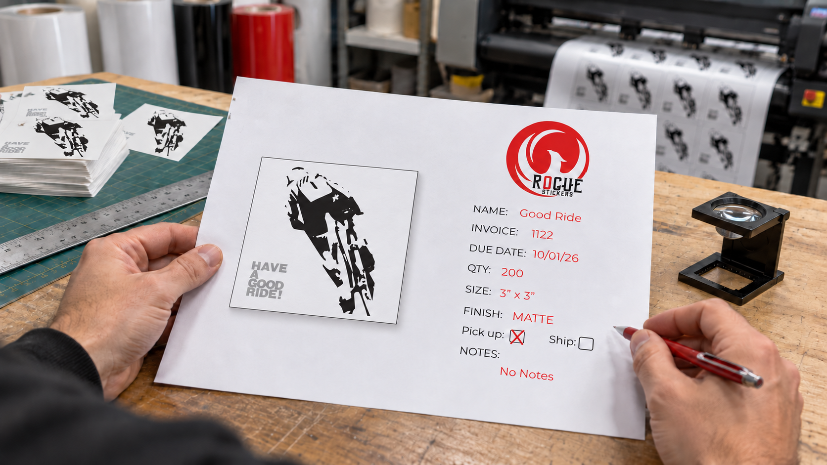
A custom sticker proof is a visual representation of how your artwork is expected to appear as a finished sticker.

Depending on the product and printer, the proof may show:

• Your submitted artwork

• The finished sticker dimensions

• The proposed cut line

• A border around the design

• The placement of artwork within the cut shape

• Areas that may be trimmed

• Notes about image quality or production concerns

The proof gives you an opportunity to identify visible problems before the order enters production. It should be reviewed carefully, even when the artwork looked correct in the original design file.

A proof is not merely a formality. Approval usually confirms that the design, spelling, size, shape, and layout shown are acceptable for production.

Why Can the Proof Look Different From the Original Artwork?

The file you submit may need adjustments before it can be produced as a sticker.

A cut line may need to be created around the artwork. A border may be added to connect separate parts of the design. The artwork may need to be positioned inside a specific shape or resized to fit the selected dimensions.

Transparent space can also affect how a design is interpreted. An image may appear centered within its full canvas while the visible artwork sits noticeably to one side.

The proof shows how these production decisions affect the finished piece. That is why you should review the proof itself instead of assuming that the uploaded file will be reproduced exactly as it appeared on your screen.

What Should You Check First on a Sticker Proof?

Begin with the basic order information before inspecting small visual details.

Confirm:

• The correct design is shown

• The quantity matches your order

• The finished dimensions are correct

• The selected sticker shape is correct

• The orientation is correct

• The requested material or finish is correct

• The order contains the correct number of designs

Do not approve a proof simply because the artwork looks familiar. A correct design printed at the wrong size is still an incorrect order.

If you ordered several designs, review each proof separately. Similar filenames and alternate logo versions can be easy to confuse.

How Do You Confirm the Sticker Size?

Read the dimensions displayed on the proof and compare them with the size you intended to order.

Do not judge physical size only by how large the proof appears on a phone or computer screen. Screens enlarge and reduce documents according to the device, browser, and zoom setting.

A three inch sticker does not necessarily appear three inches wide on your screen.

Use a ruler to visualize the stated dimensions. You can also draw the dimensions on paper, print a paper reference at actual size, or compare them with an object that will receive the sticker.

Pay particular attention when your design is unusually wide or tall. The ordered size may refer to the longest dimension rather than both dimensions. A wide sticker ordered at three inches may be three inches wide but much shorter in height.

If the proof does not clearly explain how the dimensions are measured, ask before approving it.

What Is the Cut Line on a Sticker Proof?

The cut line shows where the sticker is expected to be cut from the surrounding material.

On a custom shaped sticker, this line normally follows the general contour of the artwork. It may not follow every tiny detail. Narrow gaps, sharp points, isolated elements, and intricate edges may need to be simplified or connected into a practical outer shape.

Review the entire cut line and ask:

• Does the shape match the design?

• Is the spacing around the artwork consistent?

• Are any important details too close to the edge?

• Are separate elements connected as intended?

• Are narrow points likely to look awkward?

• Does the cut line create an unexpected background area?

The visible line used to indicate the cut path on a digital proof is generally a production guide. It is not necessarily intended to print on the finished sticker. If that is unclear, confirm it with the printer.

Why Did the Printer Add a Border Around the Design?

A border can create separation between the artwork and the cut edge. It can also connect letters, icons, and other isolated elements into one complete sticker.

White is common because it provides contrast around many designs, but other border treatments may be possible depending on the product and artwork.

Inspect the border for consistency. Look closely around:

• Text

• Hair and fur

• Small illustrated details

• Narrow spaces between objects

• Sharp corners

• Transparent areas

• Dark artwork on dark backgrounds

A border that looks balanced around a simple logo may become much wider in small interior spaces. This can happen when the cut path is simplified to create a practical shape.

If you want no visible border, make sure that instruction is compatible with the artwork and clearly reflected in the proof. Some designs require additional artwork beyond the cut line to avoid an unintended exposed edge.

Should You Check Spelling Even If the Original File Was Correct?

Yes. Read every word, number, date, phone number, web address, and social media name shown on the proof.

Check:

• Business names

• Product names

• Event dates

• Street addresses

• Phone numbers

• Website addresses

• Social media names

• QR code instructions

• Legal or safety wording

• Capitalization

• Punctuation

Do not rely on memory. Compare the proof with a trusted source such as your official website, event listing, packaging, or business records.

Read the text slowly and then read it again from the end toward the beginning. This can help reveal repeated words, missing letters, and other errors that the brain may automatically correct during normal reading.

Will the Printed Sticker Color Match the Screen Exactly?

A digital proof can show the general appearance and arrangement of colors, but it cannot guarantee an exact physical match on every screen.

Phones, monitors, tablets, and browsers can display the same color differently. Screen brightness, display settings, surrounding light, print materials, ink, and protective finishes can all influence how a color appears.

Use the proof to identify obvious issues, such as:

• A blue element appearing purple

• A missing color

• An unintended background

• Incorrect transparency

• A logo using the wrong color version

• Text that no longer contrasts with its background

If exact color matching is essential, discuss the requirement with the printer before approval. Do not assume that a bright screen color will look identical in print.

How Can You Check Whether the Artwork Is Sharp Enough?

Zoom in on the proof and inspect text, outlines, logos, and small details.

Watch for:

• Blurry edges

• Pixelated curves

• Fuzzy lettering

• Compression marks

• Rough transparent edges

• Small details merging together

• Fine text becoming difficult to read

Remember that zooming far beyond the finished size can make acceptable artwork look rough. The more useful question is whether the design will remain clear at the actual printed dimensions.

View the proof at approximately its intended physical size whenever possible. A design may look excellent when enlarged across a computer monitor but become unreadable as a two inch sticker.

Is the Artwork Properly Centered?

Look at the visible design rather than the rectangular canvas that may surround it.

A transparent file can contain unused space that affects automatic positioning. The artwork may technically be centered within the file while appearing off center inside the cut shape.

Check the visual balance on every side. A design does not always need mathematically equal spacing, but it should look intentional.

Round logos, illustrated characters, arched text, and asymmetrical artwork deserve particular attention. An element that extends farther on one side can make the design feel unbalanced even when the file is technically centered.

Should You Test the QR Code on the Proof?

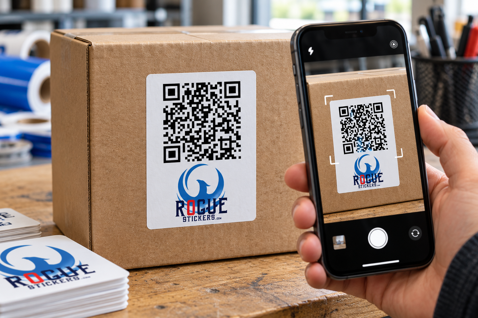
If the sticker contains a QR code, test it from the final proof.

Confirm that it opens the correct destination and that the destination works properly on a phone. Check the complete web address instead of assuming that a successful scan leads to the right page.

The proof should also preserve clear space around the code. Text, photographs, borders, and decorative graphics should not crowd the code.

A scan from a digital proof does not guarantee that every printed sticker will scan in every environment. Finished size, print clarity, glare, curvature, lighting, and placement can affect performance. Testing the proof is still an important first step.

What Does a Digital Proof Not Show?

A digital proof is useful, but it does not reproduce every physical characteristic of the final sticker.

It may not accurately demonstrate:

• Exact printed color

• Surface texture

• Gloss or matte reflection

• Metallic effects

• Holographic movement

• Transparency on the final application surface

• The feel of the material

• Exact appearance under outdoor lighting

• Adhesion to a particular object

Treat the proof as a layout and production review unless the printer specifically states that it represents additional physical characteristics.

What Should You Do If Something Looks Wrong?

Do not approve the proof and hope that the issue disappears during production.

Describe the requested change clearly. Instead of saying, “The border looks strange,” explain what needs to change.

For example:

• Reduce the white border around the entire design

• Center the visible logo within the cut shape

• Correct the phone number to the number provided below

• Use the attached black logo instead of the gray version

• Move the cut line farther from the small text

• Remove the white background outside the illustration

Review the revised proof from the beginning. Correcting one issue can change spacing, dimensions, or the cut shape elsewhere.

Who Should Approve a Business Sticker Proof?

The person approving the proof should have the authority and information needed to verify the design.

For a business order, that may be:

• The owner

• A marketing manager

• A brand manager

• The designer who prepared the artwork

• An event coordinator

• A client contact responsible for the project

Avoid sending the proof through a long chain of people without identifying who has final approval. Conflicting feedback can create confusion about which version is correct.

If several people must review the design, collect their comments before sending one organized response to the printer.

What Should You Check Before Giving Final Approval?

Use this final review:

  1. Confirm the correct artwork version.

  2. Confirm the finished dimensions.

  3. Confirm the shape and orientation.

  4. Inspect the complete cut line.

  5. Review the border around the design.

  6. Check the placement and visual balance.

  7. Read every word and number.

  8. Confirm the logo and brand colors.

  9. Inspect small details at the intended size.

  10. Test every QR code and web address.

  11. Confirm the ordered material and finish.

  12. Make sure all requested corrections appear in the latest proof.

  13. Save a copy of the approved proof for your records.

Take a short break before the final review if possible. Returning with fresh eyes can make errors easier to notice.

A Careful Proof Review Protects the Final Design

A custom sticker proof is the bridge between your design file and the finished sticker. It allows you to see how the artwork, cut line, border, size, and shape will work together before production begins.

Review the proof at the intended size, check every detail, and request changes when something is unclear. A few careful minutes at the proofing stage can prevent an unwanted design from being repeated across an entire order.

Visit Rogue Stickers to explore custom sticker options for your business, packaging, event, or organization.

Read our sticker artwork preparation guide and proofing FAQ. For questions about a specific application, contact Rogue Stickers before ordering.
Posted on

How to Make QR Code Stickers That Actually Scan

How to Make QR Code Stickers That Actually Scan

Why Use a QR Code on a Custom Sticker?

A QR code sticker can turn an ordinary surface into a direct path to digital information. A customer points a phone camera at the code and can be sent to a website, menu, registration page, instruction page, contact form, or another online destination.

Unlike printing a QR code directly on permanent packaging, a sticker gives a business more flexibility. It can be added to boxes, bags, windows, signs, event materials, product inserts, and equipment without redesigning the entire item.

That flexibility is useful, but printing a QR code is not as simple as placing a small black square in the corner of a design. The code must remain large enough, clear enough, and accessible enough for a phone to read it.

What Makes a QR Code Sticker Scannable?

A phone camera must be able to recognize the shape of the code and distinguish its dark and light modules. Modules are the small squares that form the complete QR code.

Reliable scanning depends on several connected factors:

• The printed size of the code

• The distance between the phone and the sticker

• The contrast between the code and its background

• The amount of clear space around the code

• The complexity of the encoded information

• The sharpness of the printed artwork

• The surface and location of the sticker

• Lighting, reflections, curves, and viewing angle

A code may work perfectly on a computer screen and still become difficult to scan after it is reduced, printed, laminated, bent around a container, or placed beneath glare.

How Large Should a QR Code Sticker Be?

There is no single minimum size that works for every QR code sticker. The correct size depends on the code itself, the expected scanning distance, the printing process, and the environment where it will be used.

A small code viewed from a few inches away may scan successfully. That same code may fail if customers are expected to scan it from several feet away.

Codes also become more visually complex as they contain more information. A dense code has more modules packed into the same area. If that code is printed too small, those modules may lose definition.

Choose the finished sticker size according to how customers will actually use it. A code on a product box can be scanned at close range. A code on a storefront window, event display, or wall sign may need to be considerably larger.

Do not reduce a QR code simply because it technically fits inside the artwork. It must remain practical for the person holding the phone.

What Is the Clear Space Around a QR Code?

The empty border surrounding a QR code is called the quiet zone. It separates the code from text, photographs, patterns, logos, and other design elements.

A standard QR code requires a clear margin four modules wide on every side. A module is one of the individual squares within the code.

The quiet zone is part of the functional design. It should not be filled with:

• Text

• Decorative borders

• Background patterns

• Photographs

• Icons

• Additional branding

• Parts of an illustration

Crowding the code can make it harder for a camera to identify where the code begins and ends. If the sticker design feels cramped, enlarge the sticker or simplify the surrounding artwork instead of removing the clear margin.

Do QR Codes Need to Be Black and White?

Black on white is a dependable choice because it creates strong visual separation, but color can be used when sufficient contrast is preserved.

The darker portions of the code should remain clearly different from the light background. Pale colors, similar shades, busy photographs, gradients, and transparent areas can reduce readability.

Reversing the traditional arrangement by placing a light code on a dark background may also create inconsistent results between devices and applications. A conventional dark code on a clean light field is generally the safer option.

Brand colors can still appear elsewhere on the sticker. The QR code does not need to carry the entire visual identity of the design.

Can You Put a Logo Inside a QR Code?

Some QR code generators allow a logo or icon to appear in the center of the code. Error correction can sometimes allow a code to remain readable when a portion is modified or obscured.

That does not make every logo treatment safe.

A logo that is too large can cover essential modules. Decorative changes to the corner markers can also interfere with recognition. The more a code is altered, the more important real testing becomes.

If the logo is already displayed elsewhere on the sticker, keeping the QR code visually simple may produce a more dependable result.

Never assume that a customized code works because the generator successfully created it. Test the exact artwork that will be printed.

Should You Use a Static or Dynamic QR Code?

A static QR code contains its final destination directly. Once created and printed, that destination cannot normally be changed without replacing the sticker.

A dynamic QR code typically directs the user through a managed redirect. The destination may be editable through the provider even after the sticker has been printed.

This can be useful when a business expects a page address or campaign destination to change. However, the continued function of a dynamic code may depend on the service that created or hosts it. Features, tracking, subscriptions, and account requirements differ by provider.

Before ordering a large quantity, confirm:

• Whether the destination can be changed

• Whether the service requires continuing payment

• What happens if the account is canceled

• Whether scan tracking is included

• Whether the redirect domain is trustworthy

• Whether the code will continue working over the intended lifespan

Rogue Stickers does not need access to private account information to print artwork, but the submitted QR code should already be active and tested.

What Should the QR Code Link To?

The best destination is a page that makes sense at the moment the sticker is scanned.

Possible destinations include:

• A restaurant menu

• A product instruction page

• An event registration page

• A warranty form

• A business contact page

• A review request page

• A campaign landing page

• A product authenticity page

• A portfolio or artist page

• A digital catalog

Send customers to a specific useful page instead of making them search through a general home page.

The destination should also work well on a phone. A perfectly printed QR code still creates a poor experience if it opens a slow page, an expired promotion, a desktop only form, or content that does not match the invitation on the sticker.

Should a QR Code Sticker Include Instructions?

A short call to action tells customers why they should scan the code.

Examples include:

• Scan to view the menu

• Scan for care instructions

• Scan to register

• Scan to see available colors

• Scan to contact us

• Scan to learn more

Avoid vague wording when a more useful instruction is available. Customers are more likely to understand the purpose of the code when the expected result is stated clearly.

Keep the instruction close enough to be associated with the code without entering the quiet zone.

Where Should You Place a QR Code Sticker?

Place the sticker where a person can comfortably point a phone at it.

Avoid locations that are:

• Hidden behind handles or packaging folds

• Close to the floor

• High above normal viewing level

• Covered by another label

• Frequently scratched or rubbed

• Strongly curved

• Beneath intense glare

• Difficult to approach

• Likely to become dirty

Curved drinkware, bottles, poles, and containers deserve special attention. A large QR code wrapped around a narrow object may bend enough that a camera cannot see the complete pattern at once.

For a curved surface, a smaller code may lie flatter, but it must still be large enough to print and scan clearly. Testing the actual sticker on the actual object is the safest approach.

Can You Put a QR Code Sticker on a Window?

Yes, but visibility and placement matter.

A code intended to be scanned from outside should face the customer and remain accessible when the business is closed. Reflections, tinted glass, direct sunlight, interior lighting, and viewing distance can all affect scanning.

If the sticker will be viewed through glass, test it from the correct side and at the expected distance. Do not rely only on a close scan under indoor lighting.

Austin and other Texas businesses should also consider how direct sunlight changes glare and visibility during the day. Test the planned location in the morning, afternoon, and evening when practical.

What File Should You Submit for QR Code Sticker Printing?

Use the cleanest version available. Vector artwork is useful because it can be resized without turning the modules into blurry pixels.

If a raster image is used, it should have enough resolution at the final printed size. Do not take a screenshot of a QR code and enlarge it. Enlarging a small screenshot can soften the edges between modules.

The final file should preserve:

• A square overall code shape

• Sharp module edges

• Strong contrast

• The complete quiet zone

• The correct destination

• Adequate resolution

• The intended finished size

Review the exported file after designing the sticker. Some editing programs may compress, blur, recolor, or resample artwork during export.

How Should You Test a QR Code Before Printing?

Test the exact final file rather than an earlier version of the code.

A practical review should include:

  1. Open the finished artwork at its intended physical size.

  2. Scan it with more than one phone when possible.

  3. Confirm that it opens the correct destination.

  4. Check the page on a mobile device.

  5. Print a sample at actual size.

  6. Test the printed sample under realistic lighting.

  7. Test from the distance customers will use.

  8. Apply the sample to the intended surface.

  9. Test again after application.

  10. Confirm that glare, texture, and curvature do not interfere.

Testing several devices does not guarantee that every phone will behave identically, but it can reveal obvious problems before a full order is produced.

What Are the Most Common QR Code Sticker Mistakes?

The most common problems are usually preventable:

• Printing the code too small

• Removing the quiet zone

• Placing the code over a photograph

• Using weak color contrast

• Stretching the code out of proportion

• Uploading a blurry screenshot

• Covering modules with a large logo

• Linking to the wrong page

• Using an expired or restricted destination

• Placing the sticker on a sharp curve

• Testing only on a computer screen

• Forgetting to test the finished sticker

A QR code should be treated as functional artwork. Appearance matters, but reliable scanning is the first requirement.

Plan the Sticker Around the Scan

A successful QR code sticker connects a physical moment to a useful digital destination. That connection depends on more than generating the code.

Think about where the sticker will be placed, how far away the customer will stand, what lighting will be present, and what the customer expects to find after scanning.

Keep the code clear, protect its quiet zone, use strong contrast, and test the final printed size on the real surface.

When the design and destination work together, a custom QR code sticker can make menus, packaging, events, instructions, and customer communication easier to access.

Visit Rogue Stickers to explore custom sticker options for your next business, packaging, or event project.

Read our sticker artwork preparation guide and proofing FAQ. For questions about a specific application, contact Rogue Stickers before ordering.

Posted on

Why Won’t My Sticker Stick? A Guide to Surfaces and Proper Application

Why Won’t My Sticker Stick? A Guide to Surfaces and Proper Application

Why Won’t My Sticker Stick?

When a vinyl sticker will not stay down, it is easy to assume that the adhesive is defective. Sometimes that may be the issue, but many adhesion problems begin with the surface rather than the sticker.

Dust, grease, wax, moisture, texture, cold temperatures, and certain plastics can all interfere with the bond. Even a surface that looks clean may contain residue that prevents the adhesive from making full contact.

Understanding the surface before applying or ordering stickers can prevent lifting edges, bubbles, and premature failure.

What Surfaces Do Vinyl Stickers Stick to Best?

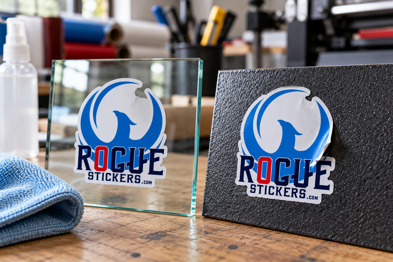
Vinyl stickers generally perform best on surfaces that are smooth, clean, dry, and nonporous.

Common examples include:

• Glass

• Smooth painted metal

• Stainless steel

• Aluminum

• Finished plastic

• Smooth sealed surfaces

• Clean vehicle windows

• Smooth product packaging

The adhesive needs direct contact with the surface. Smooth materials allow more of the adhesive to touch the object, creating a better opportunity for the bond to develop.

A sticker applied to a clean glass window will usually have much more adhesive contact than the same sticker applied to a rough brick wall.

Why Do Stickers Struggle on Textured Surfaces?

Texture creates small peaks and valleys between the adhesive and the surface. The sticker may touch the raised areas while leaving gaps over the lower areas.

This reduces the total contact between the adhesive and the object. The sticker may initially appear secure but begin lifting around the edges later.

Common difficult surfaces include:

• Textured walls

• Brick

• Concrete

• Rough wood

• Fabric

• Canvas

• Heavily textured powder coating

• Uneven plastic

Applying more pressure may help on mild texture, but it cannot always overcome a surface that is too rough for the adhesive.

If the intended surface is unfamiliar, testing one sticker before ordering or applying a large quantity is the safest approach.

Why Do Stickers Have Trouble Sticking to Silicone and Rubber?

Silicone, rubber, and some plastics have low surface energy. In simple terms, this means an adhesive may have difficulty spreading across and bonding to the surface.

Polyethylene and polypropylene can also present adhesion challenges, depending on the specific material and adhesive. These plastics are used in many containers, coolers, storage bins, and molded products.

A sticker that bonds well to glass may not perform the same way on a silicone bottle sleeve or flexible plastic container. The appearance of the surface alone does not reveal how well an adhesive will work.

When the material is unknown, apply a sample and observe it under the same conditions in which the finished sticker will be used.

Can Dirt or Oil Stop a Sticker From Sticking?

Yes. Dust, fingerprints, grease, wax, polish, and other contaminants can create a barrier between the sticker and the surface.

This is common with items that are frequently handled, including:

• Drinkware

• Coolers

• Toolboxes

• Helmets

• Vehicle surfaces

• Laptops

• Product containers

Cleaning the surface is one of the most important steps in sticker application.

Use a cleaning method that is safe for the specific material. Some surfaces can be damaged or discolored by strong cleaners. Products that leave behind wax, fragrance, silicone, or polish can also interfere with adhesion.

After cleaning, allow the surface to dry completely before applying the sticker.

How Should You Prepare a Surface for a Vinyl Sticker?

Follow these steps before application:

  1. Confirm that the surface is suitable for adhesive vinyl.
  2. Remove visible dust, dirt, grease, and residue.
  3. Use a cleaner that is safe for the material.
  4. Dry the surface completely with a clean cloth.
  5. Avoid touching the cleaned area with your fingers.
  6. Position the sticker before removing the entire backing.
  7. Apply steady pressure across the complete design.
  8. Pay particular attention to corners, narrow sections, and outer edges.

Pressure sensitive adhesives need pressure to establish contact. Simply placing a sticker on a surface without pressing it firmly may leave weak areas beneath the vinyl.

Does Temperature Affect Sticker Adhesion?

Temperature can affect both the sticker adhesive and the application surface.

When conditions are too cold, an adhesive may become less flexible and may not spread across the surface effectively. Excessive heat can also make installation more difficult by causing the vinyl to become soft or stretch.

The sticker, surface, and surrounding air should be within the application range recommended for the specific material. Because that range varies between products, there is no single temperature that applies to every sticker.

This is especially important in Texas. A metal sign, vehicle window, or outdoor container sitting in direct summer sunlight may become much hotter than the surrounding air. During winter, outdoor surfaces may also be too cold for dependable installation.

Whenever possible, apply stickers in a clean, controlled environment rather than in direct sunlight or extreme weather.

Can You Put Stickers on Fresh Paint?

Fresh paint may feel dry before it is fully cured. During the curing process, the paint can continue releasing moisture or other compounds that interfere with adhesion.

Applying a sticker too soon may result in bubbling, lifting, or damage when the sticker is removed.

Curing times depend on the type of paint, surface, temperature, humidity, and manufacturer instructions. Follow the paint manufacturer’s full curing guidance rather than assuming that a dry surface is ready.

For valuable walls, signs, vehicles, or equipment, test a small hidden area first.

Why Are the Edges of My Sticker Lifting?

Lifting edges can result from several conditions:

• The surface was dirty or oily

• The material was textured

• The sticker was applied when it was too cold

• Moisture was trapped beneath the vinyl

• The edge was repeatedly rubbed or handled

• Part of the sticker crosses a seam or curve

• The sticker was stretched during installation

• The adhesive is not compatible with the surface

Complex shapes can also contain narrow points that receive more wear than rounded edges. When planning a sticker for equipment, packaging, or frequently handled objects, a smoother outer contour may be more practical than several thin projections.

Can a Sticker Be Removed and Applied Again?

Most adhesive vinyl stickers are intended for one application.

Once removed, the adhesive may contain dust, skin oils, fibers, or fragments from the original surface. The vinyl may also stretch or curl during removal. Even if the sticker attaches again, the second bond may not be as reliable.

For the best result, decide on the position before fully pressing the sticker down.

How Soon Can a New Sticker Get Wet?

Adhesive bonds often develop after application, but the required time varies by material. Avoid assuming that every sticker can be washed or exposed to weather immediately.

Follow the care instructions for the specific sticker. If no instructions are available, keep the applied sticker dry while the adhesive establishes its bond and avoid aggressive washing around the edges.

Outdoor use, dishwasher exposure, hand washing, and occasional water contact are different conditions. Confirm that the sticker material is intended for the actual environment before ordering.

How Can You Test an Unfamiliar Surface?

A small application test is the most dependable way to evaluate an unusual surface.

Apply a sample to a clean section of the actual object. Press it firmly and observe the sticker under realistic conditions. Check the edges, narrow sections, and any areas crossing curves or texture.

If the sticker will be used outdoors, the test should reflect the expected heat, moisture, handling, and sunlight. A sticker that appears secure after a few minutes indoors may behave differently after extended exposure.

Testing is particularly valuable when ordering stickers for containers, powder coated equipment, flexible plastics, silicone products, or textured materials.

Choose the Sticker Based on Where It Will Be Used

Artwork is only one part of a successful custom sticker. The surface and environment are equally important.

Before ordering, consider:

• What material will receive the sticker?

• Is the surface smooth or textured?

• Will it be exposed to water or sunlight?

• Will people handle it frequently?

• Does the sticker need to follow a curve?

• Can the surface be cleaned safely?

Answering these questions helps you choose a format suited to the real application instead of selecting a sticker based only on appearance.

Explore custom sticker options from Rogue Stickers or learn more about custom sticker printing in Austin.


Compare sticker styles and materials and read our surface preparation guide. For questions about a specific application, contact Rogue Stickers before ordering.